Your setting is exactly my setting and I think if press F5 several times (trigger between preview mode) you will see this bug.
As I told you, the bug only happens randomly when the chart is updated or the page is refreshed or in designer, you trigger preview mode.
Yes i did try preview mode as you are correct that sometimes going into preview things change. i have also pushed a version of this to our live project and i do not have any issues. This maybe something that Inductive technical support can help with. they know all the properties and how they affect components much better than i do.
1 Like
I finally find the bug. When I put the XY chart in a flex container it shrinks without looking shrink, grow settings, so I have to put the XY chart in XY coordinate container first and then put it in flex.
The problem appears when I change the XY coordinate container mode to percent.
For solving this bug, I simply change it to fixed mode and use width: 100%, height: 100% instead.
My only problem is how to change its style?
2 Likes
In this thread, I got some help with style changing some with CSS
I have a different question though.
I want my legend to appear at the top, but with the second series, I am not sure how to hide that label specifically in the legend.

{name}
shows both names from each series
oh, apparently, I can just delete the name in the duplicated series, and since the value shown is determined in the label, the numbers still show correctly.

1 Like
For color, font size and so on, you can use the series tooltip.text formatting.
For example, setting the bullet's label.text to "[bold;#CC3333;font-size:20px]{field}" makes the label on top of the bar display "field" as a red, bold text with size 20px.
I'm still looking for the documentation on how I can pass multiple styles.
It would also be cool to make the label appear depending on some condition. For example, if a bar has the value 0, I don't see the point in displaying "0" and no bar...
1 Like
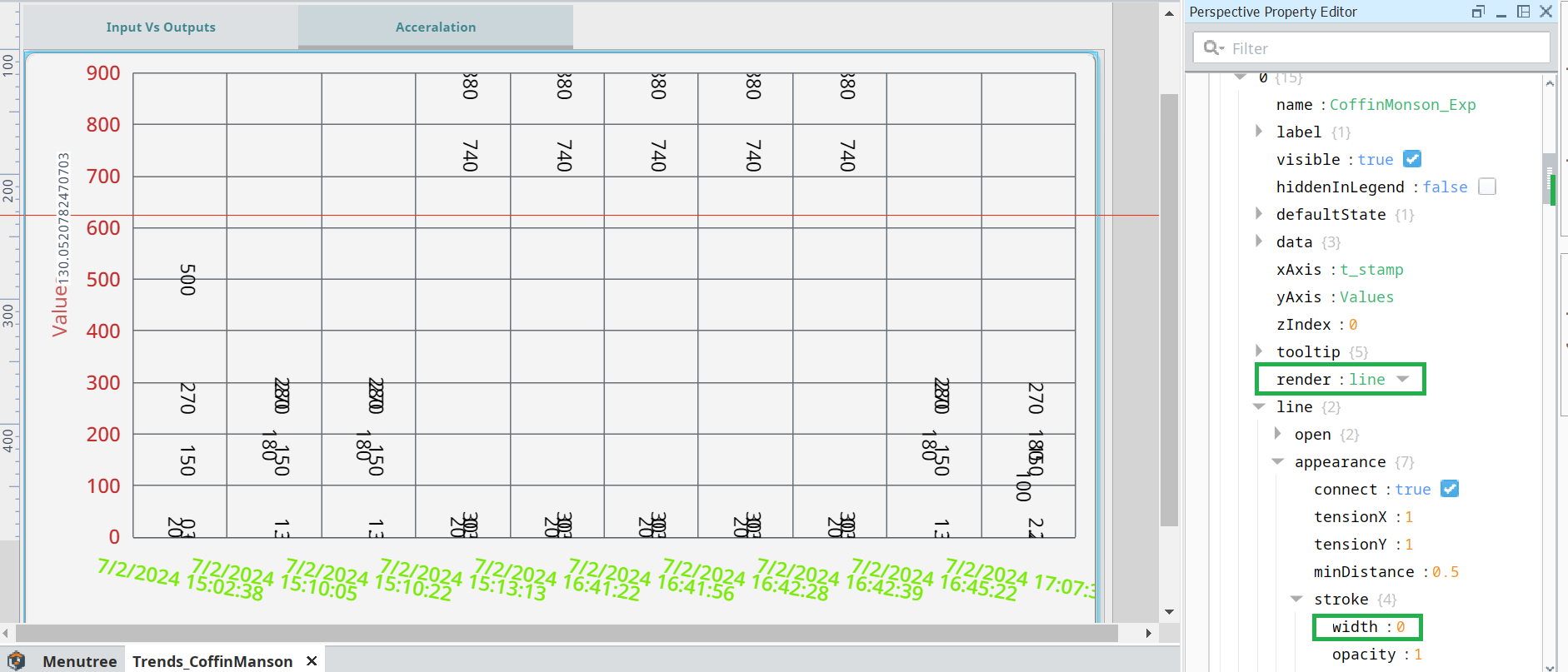
how its possibe first my data is come data set then follow this prop then not coming bar chart only showing line chart and value
to get the bar chart you need to make a series with the render property set to bar. My example on this was to create a line with labels to go in addition to the bars.

The answer is in post #2. You can't apply labels to columns. You need to copy series 0 to series 1 and render that as a line. Then copy the settings shown in post #2. You can make the line and bullets invisible so that only the labels show.
1 Like
Dan, you need to be more specific. Change the color of what text.
Hello Phil_B,
As you I did the same but it's not working me. Can you help me on this?
**Expected Chart: This comparison of different values with respect to time for last 10 different time. Each bar should be showing its value.

When I'm apply property as you suggested getting below result.