No, I try to keep most things consistent like you do, seeing your shared iterations. This was more geared towards widgets in the Dashboard component. If they have it take up half of the screen, there is a lot of space available to make the text bigger.
Alternative Alarm Status Table Styling - Use Pills for Priority and State columns
Disclaimer: I haven’t tested any of this all that thoroughly yet!
I had a request from a customer to change the alarm status table styles. This was a bit of fun (and headache).
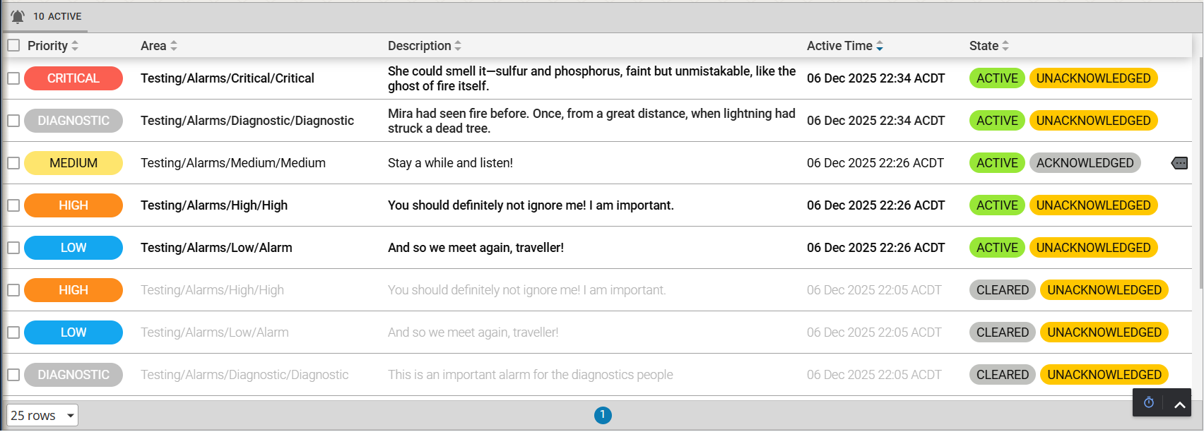
This requires CSS and a bit of JS injection (required for the splitting of the State values).
It has a number of parts:
-
Alarm Status Table component which contains specific rowStyles
Alarm Status Table - Copy JSON and Paste into a Flex Container
[ { "type": "ia.display.alarmstatustable", "version": 0, "props": { "refreshRate": 2000, "toolbar": { "enableShelvedTab": false, "enableFilter": false, "toggleableFilter": false, "enablePreFilters": false, "enableConfiguration": false }, "filters": { "active": { "priorities": { "diagnostic": true } } }, "rowStyles": { "activeUnacked": { "base": { "backgroundColor": "white", "color": "hsl(0 0% 5%)", "maxHeight": "3rem", "minHeight": "3rem" }, "priorities": { "low": { "backgroundColor": "white" }, "medium": { "backgroundColor": "white" }, "high": { "backgroundColor": "white" }, "critical": { "backgroundColor": "white" } } }, "activeAcked": { "base": { "backgroundColor": "white", "color": "hsl(0 0% 5%)", "fontWeight": "normal", "maxHeight": "3rem", "minHeight": "3rem" }, "priorities": { "low": { "backgroundColor": "white" }, "medium": { "backgroundColor": "white" }, "high": { "backgroundColor": "white" }, "critical": { "backgroundColor": "white" } } }, "clearUnacked": { "base": { "backgroundColor": "white", "fontWeight": "lighter", "color": "hsl(0 0% 70%)", "maxHeight": "3rem", "minHeight": "3rem" }, "priorities": { "diagnostic": { "backgroundColor": "white", "color": "hsl(0 0% 70%)" }, "low": { "backgroundColor": "white" }, "medium": { "backgroundColor": "white" }, "high": { "backgroundColor": "white" }, "critical": { "backgroundColor": "white" } } }, "clearAcked": { "base": { "backgroundColor": "white", "color": "hsl(0 0% 70%)", "fontWeight": "lighter", "maxHeight": "3rem", "minHeight": "3rem" }, "priorities": { "diagnostic": { "color": "hsl(0 0% 70%)" }, "low": { "backgroundColor": "white" }, "medium": { "backgroundColor": "white" }, "high": { "backgroundColor": "white" }, "critical": { "backgroundColor": "white" } } } }, "dateFormat": "DD MMM yyyy HH:mm z", "activeSortOrder": [ "activeTime" ], "columns": { "active": { "activeTime": { "sort": "descending", "width": 230, "strictWidth": true, "order": 3 }, "displayPath": { "width": 350, "strictWidth": true }, "priority": { "sort": "none", "width": 160, "strictWidth": true, "order": 0 }, "state": { "sort": "none", "width": 320, "strictWidth": true, "order": 4 }, "source": { "enabled": false, "width": 240, "order": 3 }, "name": { "enabled": false, "order": 2 } } }, "columnsAssociated": { "active": [ { "field": "Description", "enabled": true, "width": "", "strictWidth": false, "sort": "none", "order": 2 } ] } }, "meta": { "name": "AlarmStatusTable" }, "position": { "grow": 1, "basis": "400px" }, "custom": {} } ] -
Markdown Javascript injector component which converts the State column text into separate components and adds them into a flex
Markdown JS Injector (State-only mods) - Copy JSON and Paste into the View containing the AST
[ { "type": "ia.display.markdown", "version": 0, "props": { "style": { "flex": "--neutral-40" }, "markdown": { "escapeHtml": false } }, "meta": { "name": "JSInject_ConvertStateColToPillBoxes" }, "position": { "shrink": 0, "basis": 0 }, "custom": { "inlineJavascript": "(() => {\n const styleAlarmStates = () => {\n document.querySelectorAll(\".ia_table__cell[data-column-id=state]:not(.ia_table__head__header__cell) .content > div\").forEach(el => {\n if (el.querySelector(\".custom_alarmStatusTable__stateCol_pill\"))\n return;\n const text = el.textContent.trim();\n if (!text)\n return;\n const parts = text.split(\",\").map(s => s.trim());\n const classMap = {\n \"Active\": \"custom_alarmStatusTable__stateCol_active\",\n \"Cleared\": \"custom_alarmStatusTable__stateCol_cleared\",\n \"Acknowledged\": \"custom_alarmStatusTable__stateCol_ack\",\n \"Unacknowledged\": \"custom_alarmStatusTable__stateCol_unack\"\n };\n const pills = parts.map(part => {\n const stateClass = classMap[part] || \"\";\n return \"<span class=\\\"custom_alarmStatusTable__stateCol_pill \" + stateClass + \"\\\">\" + part + \"</span>\";\n }).join(\"\");\n el.innerHTML = \"<div class=\\\"custom_alarmStatusTable__stateCol_container\\\">\" + pills + \"</div>\";\n });\n };\n const setupObserver = () => {\n let rafId;\n const observer = new MutationObserver(() => {\n if (rafId)\n return;\n rafId = requestAnimationFrame(() => {\n styleAlarmStates();\n rafId = null;\n });\n });\n const tableContainer = document.querySelector(\".ReactVirtualized__Grid__innerScrollContainer\");\n if (tableContainer) {\n styleAlarmStates();\n observer.observe(tableContainer, {\n childList: true,\n attributes: true,\n subtree: true,\n attributeFilter: [\"title\", \"style\"]\n });\n }\n };\n setupObserver();\n if (!document.querySelector(\".ReactVirtualized__Grid__innerScrollContainer\")) {\n const waitObserver = new MutationObserver(() => {\n if (document.querySelector(\".ReactVirtualized__Grid__innerScrollContainer\")) {\n waitObserver.disconnect();\n setupObserver();\n }\n });\n waitObserver.observe(document.body, {\n childList: true,\n subtree: true\n });\n }\n})();\n" }, "propConfig": { "props.source": { "binding": { "config": { "struct": { "script": "{this.custom.inlineJavascript}" }, "waitOnAll": true }, "transforms": [ { "code": "\tcode = \"<img style='display:none' src='/favicon.ico' onload=\\\"\" + value.script.replace('\"', '"') + '\\\"></img>'\n\t\n\tcode = code.replace(\"\\n\", \"\").replace(\"\\t\", \"\").replace(\"\\n\", \"\").replace(\"\\r\", \"\").replace(\"\\r\", \"\").replace(\" \", \" \").replace(\" \", \" \").replace(\" \", \" \").replace(\" \", \" \")\n\t\n\treturn code", "type": "script" } ], "type": "expr-struct" } } } } ] -
CSS to add to the Advanced Stylesheet
Stylesheet CSS to define the: alarm priority colours and the state pill styles
/* === Setup the standard colour variables ================================================================================= */

:root {
	/** Format: --c-<area>-<prop><-modifier>, where 'c' means 'colour' **/

	/* Alarm Priority Colours */
	--c-alarm-critical:   hsl(5 95% 65%); /* red */
	--c-alarm-critical-text:   white;

	--c-alarm-high:       hsl(30, 98%, 55%); /* orange */
	--c-alarm-high-text:       white;

	--c-alarm-medium:     hsl(50, 98%, 71%); /* yellow */
	--c-alarm-medium-text:     hsl(0, 0%, 5%);

	--c-alarm-low:        hsl(200, 88%, 51%); /* blue */
	--c-alarm-low-text:        white;

	--c-alarm-diagnostic: hsl(0, 0%, 75%); /* grey */
	--c-alarm-diagnostic-text: white;
}

/* === Alarm Status Table Styles =================================================================== */

/* Allow cell text to word wrap */
.alarmStatusTable .ia_table__cell .content div {
	white-space: pre-wrap;
}

/* Make the Priority column show a pill-box with the priority colour in the background */
.alarmStatusTable .ia_table__cell[data-column-id="priority"] .content:has([title]){
	width: 7rem;
	border-radius: 50vh;
	height: 1.7rem;
	padding: 0.2rem 0.5rem;
	text-align: center;
	font-weight: normal;
	text-transform: uppercase;
	justify-content: center !important;
	align-items: center;
}
.alarmStatusTable .ia_table__cell[data-column-id="priority"] .content:has([title="Critical"]) {
	background-color: var(--c-alarm-critical);
	color: var(--c-alarm-critical-text);
}
.alarmStatusTable .ia_table__cell[data-column-id="priority"] .content:has([title="High"]) {
	background-color: var(--c-alarm-high);
	color: var(--c-alarm-high-text);
}
.alarmStatusTable .ia_table__cell[data-column-id="priority"] .content:has([title="Medium"]) {
	background-color: var(--c-alarm-medium);
	color: var(--c-alarm-medium-text);
}
.alarmStatusTable .ia_table__cell[data-column-id="priority"] .content:has([title="Low"]) {
	background-color: var(--c-alarm-low);
	color: var(--c-alarm-low-text);
}
.alarmStatusTable .ia_table__cell[data-column-id="priority"] .content:has([title="Diagnostic"]) {
	background-color: var(--c-alarm-diagnostic);
	color: var(--c-alarm-diagnostic-text);
}


/* defines the flex container housing the two state pills */
.custom_alarmStatusTable__stateCol_container {
  display: flex;
  gap: 0.3rem;
  align-items: center;;
}
/* styles for the pill containers housing the active/cleared and ack/unack states */
.custom_alarmStatusTable__stateCol_pill {
  border-top-left-radius: 50vh;
  border-top-right-radius: 50vh;
  border-bottom-left-radius: 50vh;
  border-bottom-right-radius: 50vh;
  margin: ;height: 150%;
  padding: 0.2rem 0.5rem;
  text-transform: uppercase;
}
/* styles for the ack state */
.custom_alarmStatusTable__stateCol_ack {
  background-color: #C0C1BE;
  color: hsl(0 0% 5%);
  font-weight: normal;
}
/* styles for the unack state */
.custom_alarmStatusTable__stateCol_unack {
  background-color: #FFC700;
  color: hsl(0 0% 5%);
  font-weight: normal;
}
/* styles for the active state */
.custom_alarmStatusTable__stateCol_active {
  background-color: #98E737;
  color: hsl(0 0% 5%);
  font-weight: normal;
}
/* styles for the cleared state */
.custom_alarmStatusTable__stateCol_cleared {
  background-color: #C0C1BE;
  color: hsl(0 0% 5%);
  font-weight: normal;
}
If you just want to import a single View, here’s the project export in 8.3.2. You’ll still need to copy in the styling into the adv. stylesheet though.
AlarmStatusTable-AlternateStyling.zip (44.2 KB)
They also wanted the datetime formatted differently as well, in case you want this too. If so, replace the Markdown above with this version:

Markdown JS Injector (State & Datetime mods) - Copy JSON and Paste into the View containing the AST
[
{
"type": "ia.display.markdown",
"version": 0,
"props": {
"style": {
"position": "absolute"
},
"markdown": {
"escapeHtml": false
}
},
"meta": {
"name": "JSInject_ConvertStateColToPillBoxes_0"
},
"position": {
"shrink": 0,
"basis": 0
},
"custom": {
"inlineJavascript": "(() => {\n const styleAlarmStates = () => {\n document.querySelectorAll(\".ia_table__cell[data-column-id=state]:not(.ia_table__head__header__cell) .content > div\").forEach(el => {\n if (el.querySelector(\".custom_alarmStatusTable__stateCol_pill\"))\n return;\n const text = el.textContent.trim();\n if (!text)\n return;\n const parts = text.split(\",\").map(s => s.trim());\n const classMap = {\n \"Active\": \"custom_alarmStatusTable__stateCol_active\",\n \"Cleared\": \"custom_alarmStatusTable__stateCol_cleared\",\n \"Acknowledged\": \"custom_alarmStatusTable__stateCol_ack\",\n \"Unacknowledged\": \"custom_alarmStatusTable__stateCol_unack\"\n };\n const pills = parts.map(part => {\n const stateClass = classMap[part] || \"\";\n return \"<span class=\\\"custom_alarmStatusTable__stateCol_pill \" + stateClass + \"\\\">\" + part + \"</span>\";\n }).join(\"\");\n el.innerHTML = \"<div class=\\\"custom_alarmStatusTable__stateCol_container\\\">\" + pills + \"</div>\";\n });\n };\n\n const formatDateTimeCells = () => {\n document.querySelectorAll('.alarmStatusTable .ia_table__cell:not(.ia_table__head__header__cell) .content > div').forEach(div => {\n const title = div.getAttribute('title');\n const datetimeRegex = /^\\d{4}-\\d{2}-\\d{2} \\d{2}:\\d{2}:\\d{2}\\.\\d{3}[+-]\\d{4}$/;\n \n if (title && datetimeRegex.test(title) && !div.querySelector('div[style*=\"flex\"]')) {\n const text = div.textContent.trim();\n const parts = text.split(' ');\n \n if (parts.length >= 5) {\n const date = parts.slice(0, 3).join(' ').trim();\n const time = parts.slice(3).join(' ').trim();\n \n div.innerHTML = `\n <div style=\"display: flex; flex-direction: column; gap: 2px; align-items: flex-end;\">\n <div style=\"font-weight: bold;\">${date}</div>\n <div style=\"font-size: 0.9em; color: #666;\">${time}</div>\n </div>\n `;\n }\n }\n });\n };\n\n const setupObserver = () => {\n let rafId;\n const observer = new MutationObserver(() => {\n if (rafId)\n return;\n rafId = requestAnimationFrame(() => {\n styleAlarmStates();\n formatDateTimeCells();\n rafId = null;\n });\n });\n const tableContainer = document.querySelector(\".ReactVirtualized__Grid__innerScrollContainer\");\n if (tableContainer) {\n styleAlarmStates();\n formatDateTimeCells();\n observer.observe(tableContainer, {\n childList: true,\n attributes: true,\n subtree: true,\n attributeFilter: [\"title\", \"style\"]\n });\n }\n };\n\n const visibilityObserver = new MutationObserver((mutations) => {\n for (const mutation of mutations) {\n if (mutation.type === \"attributes\" &&\n mutation.attributeName === \"style\" &&\n mutation.target.getAttribute(\"data-component\") === \"ia.display.alarmstatustable\" &&\n mutation.target.style.display !== \"none\") {\n console.log(\"alarmStatusTable visibility observer fired\");\n if (document.querySelector(\".ReactVirtualized__Grid__innerScrollContainer\")) {\n setupObserver();\n } else {\n const revealWaitObserver = new MutationObserver(() => {\n if (document.querySelector(\".ReactVirtualized__Grid__innerScrollContainer\")) {\n revealWaitObserver.disconnect();\n setupObserver();\n }\n });\n revealWaitObserver.observe(document.body, {\n childList: true,\n subtree: true\n });\n }\n }\n }\n });\n\n visibilityObserver.observe(document.body, {\n subtree: true,\n attributes: true,\n attributeFilter: [\"style\"]\n });\n\n setupObserver();\n if (!document.querySelector(\".ReactVirtualized__Grid__innerScrollContainer\")) {\n const waitObserver = new MutationObserver(() => {\n if (document.querySelector(\".ReactVirtualized__Grid__innerScrollContainer\")) {\n waitObserver.disconnect();\n setupObserver();\n }\n });\n waitObserver.observe(document.body, {\n childList: true,\n subtree: true\n });\n }\n})();"
},
"propConfig": {
"props.source": {
"binding": {
"config": {
"struct": {
"script": "{this.custom.inlineJavascript}"
},
"waitOnAll": true
},
"transforms": [
{
"code": "#\tcode = \"<img style='display:none' src='/favicon.ico' onload=\\\"\" + value.script.replace('\"', '"') + '\\\"></img>'\n#\t\n#\tcode = code.replace(\"\\n\", \"\").replace(\"\\t\", \"\").replace(\"\\n\", \"\").replace(\"\\r\", \"\").replace(\"\\r\", \"\").replace(\" \", \" \").replace(\" \", \" \").replace(\" \", \" \").replace(\" \", \" \")\n#\t\n#\treturn code\n\tscript = value.script\n\tscript = script.replace('\"', '"')\n\tscript = script.replace('\\n', '').replace('\\t', '').replace('\\r', '')\n\t\n\t# Collapse multiple spaces - repeat until stable\n\twhile ' ' in script:\n\t script = script.replace(' ', ' ')\n\t\n\tcode = '<img style=\"display:none\" src=\"/favicon.ico\" onload=\"{}\"></img>'.format(script)\n\treturn code",
"type": "script"
}
],
"type": "expr-struct"
}
}
}
}
]
Edit: Updated the Markdown JSON (State & Datetime mods version only) with a fix to address the AST not re-formatting when it’s hidden and shown again by toggling the display prop
HSL (“human readable”) Colour Cheat Sheet
I've added this to a few posts now before realising it really belongs here…
I made an HSL cheat sheet in Perspective to help remember the Hue values in the human-readable HSL colour format (as opposed to the relatively human-unintelligable RGB).
And if you need help convincing why you should abandon RGB for HSL:

View Exports:
HSL Cheat Sheet.zip (27.8 KB)
Imagine a scenario where you have a rotation animation in a css style. If you try to apply that to a sub-element of an SVG it will rotate out of frame because SVGs anchor at 0,0 instead of center.
Apply this style along with your spinner animation to rotate a sub-element of an SVG around its center
.psc-center-origin{
transform-origin: center;
transform-box: fill-box;
}
I looked into this again briefly.
A comment, you need to set a parent “container” to be a container for this to work. If you don’t, the page container is used and the units don’t behave any different to vh and vw.
E.g.

However, as I suspected, using these units and always setting the container to be the embedded view or the parent container (flex/coord/etc) will result in a vast array of differing font sizes, since it’s based on the size of the container (embedded view / flex container / etc) and these will more than likely be different for different elements. See the example above, where the top and bottom embedded views are both instances of the same view, but one is made wider resulting in the font size being larger.
I thought I had font sizes mostly sorted with rem units and media queries to set the root font-size based on screen size, however a colleague came to me yesterday with an issue where he’s embedded main overview views onto a wider overview page where the embedded main overviews are made smaller to fit on the 1 page, and obviously the font size is now still relative to screen size rather than the size of the embedded view container, and hence the fonts are too big to fit… Using container query units would fix this, however at the expense of standardised font sizes which makes it look unprofessional… the font size saga continues.
Waffle…
Edit: The above is true for cqw and cqh, but cqmax and cqmin (and by extension the i and b units) don’t seem to have this behaviour…  i.e. below blue bordered containers are the same embedded views at different sizes. the cqmax labels, despite being contained within different max-size containers, are both the same size. Whereas the cqw labels are different sizes. I need to read up more on how the cqi and cqb units work..

Edit2:
OK, so container-type: inline-size only looks at the width, for a horizontal language like English, and cqmax looks at both width (i - inline) and height (b - block), and because inline-size only provides the width, this container is ignored and it searches further up the tree until it finds a container-type: size which provides both width and height, or the viewport itself. So if I set the embedded views instead to container-type: size, they become effectively the same size as cqw in this instance..

I’m glad I’m not alone… 
I’m not worried, I haven’t been using Perspective for very long, only like 7 years. Font sizing is a pretty advanced topic 
I did notice that the state pill boxes are inconsistent when using this as a docked view. Sometimes they transform and sometimes they dont. That’s the only bug that I have observed.
I updated the Markdown JSON for the state and datetime version to address something similar. Not sure if it also addresses your issue.
Imagine a scenario where a customer has Aveva and are resisting moving to Perspective because they want to retain the fancy graphics you find in Aveva. Here's a style that mimics Aveva displays.
.psc-aveva-border{
    background-image: linear-gradient(to bottom, rgb(155,155,155), rgb(20,30,20) 15px, rgb(85,85,80));
    border-radius: 10px;
    border-style: solid;
    border-width: 3px;
    box-shadow: 1px 3px 4px 1px rgba(255, 255, 255, 0.7);
}
Here's what it looks in Perspective on a quick and dirty screen I made.

The level indicator is just a flex container with a label in it. The Aveva style applied to the flex container (set justify to flex-end) and a basic gradient style applied to the level indicator (a label). The level display label gets its basis % controlled by a binding. The tank is just a basic tank SVG I drew but you could use any kind of tank drawing.
I'm assuming I'm not the only one being challenged to apply the same level of graphics as customers have in their Aveva installs. Not everyone is pushing for ISA 101.
Your usage of rgb instead of hsl makes me sad  I just went through a new project that we started and replaced all rgb/hex I could find. So much nicer being able to see the hues used rather than mixes of light in different quantities
Otherwise though, it looks super simple to implement. Get em across the line, then gradually over time bring those gradient colours closer together until they're identical 
Looks like the real thing!
That's a valid point.
My daughter was showing me some HSL shading that looked better than what I've been doing but I haven't taken the plunge yet. She does some color theory stuff that I don't understand but it looks really good. If my stuff is a 5, hers is at least an 8.
I'll just say that I'm aware and know that it's an area where I can improve 
It's unlikely I'll get into that soon though. I'd probably need my kid to patiently show me that stuff a few times for me to understand it in a useable way. That would require me to pull her away from her other interests. I hope to get there some day.
Maybe I just need to bribe her with guitars lol
All you really need to get your head around is Hue and what it represents. Every 30degrees (value) is a new transition to a primary/tertiary colour. Every 60 degrees is a primary, and every 30 inbetween is a seconary.
See the Hue values below, showing
- top - all of the primaries and tertiaries
- middle - primaries only (every 6o deg) and
- bottom - tertiary only (every other 30deg)

The beauty of it though is that most website colour palettes are based on a distinct set of hues, where these are then modified in saturation and lightness to get differnent shades of the same hues. Defining these in RBG is... well see the example below and you'll see.

In the HSL column, the Hue changes slightly, but right away you can see that the hue is pretty much the same for the slate colours. In RGB, you have to mentally mix R G B values in HEX together to try to work it out, for as many colours as you have -- you may as well just call them "colour1", "colour2", ... "colourN"  . If you wanted to add a new variation, good luck working it out yourself! And if you want a colour that is slightly less saturated, or lighter, or darker, you must use a colour picker to do it (and you'll be most likely be using the hsl sliders when you do!) else you'll end up with a different hue and lightness
Oh I see. That makes a lot of sense for keeping your color themes consistent across the site.
I'm using cq units on a different thing and getting inconsistent results depending on what kind of container my element is in. I'm mentioning it because it might explain some of the weirdness you're seeing with text sizing.
If I put a label inside a flex container and apply my style to the label it works fine. If it put that flex container inside another flex container it will use the dimensions of the outside flex container. If outside parent container is a coordinate container (so a coordinate container holding a flex container holding a label) it works.
I might be doing something wrong because I am still learning how to use cq units but the results seem strange to me.
The screenshot shows flex/flex/label on the left and Corod/Flex/Label on the right. Style is applied to the inner-most label.

The CSS code...
.psc-bar-chart-horiz-exp{
background-image: linear-gradient(to bottom, #328DB9, #276B8F);
color: #FFFFFF;
font-family: roboto;
font-style: 900;
font-size: 1.2rem;
text-transform: capitalize;
z-index: 3;
text-indent: 8px;
container-name: bar;
container-type: inline-size;
}


.psc-bar-chart-horiz-exp::before{
content: "";
background-image: linear-gradient(to bottom, #003553, #06567E);
position: absolute;
left: 100cqw;
height: 100.5%;
width: 15px;
top: -8px;
transform: translate(-50%, 0%);
transform: skewY(-45deg);
z-index: 1;
}


.psc-bar-chart-horiz-exp::after{
content: "";
position: absolute;

top: -15px;
left: 8px;
height: 15px;
width: 100cqw;
background-image: linear-gradient(to right, #0B4F79, #1D7DAC);

transform: skew(-45deg);
z-index: 2;

}
Sorry, I used hex colors on this one too LOL. I made that a couple years ago. I was just trying to make it use cs units now.
I initially thought I had found an issue with cqmin in the Perspective Mobile App on Android because responsive font sizing behaved differently than in a browser.
After some additional testing, it looks like cqmin may not actually be the problem. Instead, the Android app seems to enforce a minimum font size, preventing text from scaling below a certain threshold.
Has anyone else run into this? Is there a documented minimum font size in the Perspective Mobile App, or a way to disable/adjust it?
I'm curious whether this behavior comes from Perspective itself, the Android WebView, or some accessibility setting within the app.
 (ps. I know the UI could do with a bit of work... but at least it's functional for now)
That's amazing! IA should build that in
Only if they force feed HSL to the user like I did 