Hi Everyone,
I have installed Apex chart module from below link.
GitHub - Kyvis-Labs/ignition-apexcharts-module: The module provides Perspective ApexCharts components
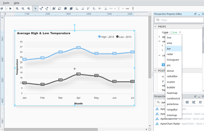
I can find only below listed chart types.
- line
- area
- bar
- radar
- histogram
- pie
- donut
- radialBar
- scatter
- bubble
- heatmap
- candlestick
- polarArea
- rangeBar
- treemap
Can anyone help me to get other types of charts like Timeline, Mixed/Combo etc... ?
Go have a look at the apexcharts website and at their example code and full api. It should hopefully answer your questions
Eg
Note that JavaScript function definitions should be contained in quotes.
E.g.
tooltipHoverFormatter: "function(val, opts) {
            return val + ' - ' + opts.w.globals.series[opts.seriesIndex][opts.dataPointIndex] + ''
          }"
kaleb.s
3
Can this be used in a report? If so, am I just adding into a script?
No, these are purely web-based charts. The report generator runs entirely in the gateway, and uses JFreeChart java objects for its charts.
So not really any way to make the charts in reporting more appealing to the eye?
There's a great deal that can be done with jython scripting using the JFreeChart APIs. It is just totally different from any web-based charting.
Is it possible to apply this to reporting charts though? I didn't think there were any mechanisms to allow it, 
Yes, there's a configureChart extension function (at least for the timeseries chart--haven't looked close at the others).
2 Likes
