ApexCharts: Dynamic DataLabels on Line Chart

Hello,

I have been working on creating ApexCharts specifically a line chart with enabled data labels. I have been tasked with making the data labels colors dynamic based on the value of the point.

For this example, if the point is above 5 then the data label needs to be red and if below then it should stay the color of the line graph.

I have been looking at similar topics such as this: ApexCharts Bar chart unique bar colors - Ignition - Inductive Automation Forum

I tried coloring labels by returning a color from dataLabels.formatter(this made the chart disappear) and by inserting functions into options.dataLabels.style.colors.

  • function(value, { seriesIndex, dataPointIndex, w }) { if (value > 5) { return '#FF0000'; } else { return '#9864FF'; } }

What other ways could I approach this?

Thanks for any help.

Here's a quick example:

Note that this syntax is only for the non-legacy ApexCharts component.

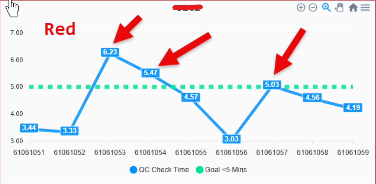
// options.dataLabels.style.colors[0]
(context) => { 

    const {dataPointIndex, seriesIndex} = context
    const value = context.series[seriesIndex][dataPointIndex]

    if (value > 25) {
        return '#FF0000'
    } 

    return '#00FF00' 
}
view.json
{
  "custom": {},
  "params": {},
  "props": {},
  "root": {
    "children": [
      {
        "meta": {
          "name": "ApexCharts"
        },
        "position": {
          "height": 300,
          "width": 300,
          "x": 84,
          "y": 227
        },
        "props": {
          "options": {
            "chart": {
              "zoom": {
                "enabled": false
              }
            },
            "dataLabels": {
              "background": {
                "enabled": true
              },
              "enabled": true,
              "style": {
                "colors": [
                  "(context) \u003d\u003e { \n    console.log(context)\n    const {dataPointIndex, seriesIndex} \u003d context\n    const value \u003d context.series[seriesIndex][dataPointIndex]\n\n    if (value \u003e 25) {\n        return \u0027#FF0000\u0027\n    } \n\n    return \u0027#00FF00\u0027 \n}"
                ]
              }
            },
            "grid": {
              "borderColor": "#f1f1f1"
            },
            "legend": {
              "tooltipHoverFormatter": "(val, opts) \u003d\u003e val + \u0027 - \u003cstrong\u003e\u0027 + opts.w.globals.series[opts.seriesIndex][opts.dataPointIndex] + \u0027\u003c/strong\u003e\u0027"
            },
            "markers": {
              "hover": {
                "sizeOffset": 6
              },
              "size": 0
            },
            "stroke": {
              "curve": "straight",
              "dashArray": [
                0,
                8,
                5
              ],
              "width": [
                5,
                7,
                5
              ]
            },
            "title": {
              "align": "left",
              "text": "Line Chart"
            },
            "tooltip": {
              "y": [
                {
                  "title": {
                    "formatter": "val \u003d\u003e val + \u0027 (mins)\u0027"
                  }
                },
                {
                  "title": {
                    "formatter": "val \u003d\u003e val + \u0027 per session\u0027"
                  }
                },
                {
                  "title": {
                    "formatter": "val \u003d\u003e val"
                  }
                }
              ]
            },
            "xaxis": {
              "position": "bottom"
            }
          },
          "series": [
            {
              "data": [
                {
                  "x": "01 Jan",
                  "y": 45
                },
                {
                  "x": "02 Jan",
                  "y": 52
                },
                {
                  "x": "03 Jan",
                  "y": 38
                },
                {
                  "x": "04 Jan",
                  "y": 24
                },
                {
                  "x": "05 Jan",
                  "y": 33
                },
                {
                  "x": "06 Jan",
                  "y": 26
                },
                {
                  "x": "07 Jan",
                  "y": 21
                },
                {
                  "x": "08 Jan",
                  "y": 20
                },
                {
                  "x": "09 Jan",
                  "y": 6
                },
                {
                  "x": "10 Jan",
                  "y": 8
                },
                {
                  "x": "11 Jan",
                  "y": 15
                },
                {
                  "x": "12 Jan",
                  "y": 10
                }
              ],
              "name": "Session Duration"
            }
          ]
        },
        "type": "embr.chart.apex-charts"
      }
    ],
    "meta": {
      "name": "root"
    },
    "type": "ia.container.coord"
  }
}
1 Like

Thank you! Worked like a charm, I appreciate the help.

1 Like

You could also do something like this, if you wanted to link the color of the datalabels to the annotations:

(context) => { 

    const {dataPointIndex, seriesIndex} = context
    const value = context.series[seriesIndex][dataPointIndex]

    const cutoff = this.props.options.annotations.yaxis[0].y

    if (value > cutoff) {
        return '#FF0000'
    } 

    return '#00FF00' 
}

I did have to enable the redraw property and disable the animations to get this effect. There might be some other way to get around getting the chart to redraw, but this was the lowest effort option.

1 Like