Sorry for the late reply, Anton, our family got Covid-tized, so we’re quarantined for a while. The bright side is that I get to help out with this sort of stuff. 
I don’t have a 7.9 system to play with at the moment. You’ll need to make an 8.1 installation if you want to use the file I posted. Note that I trimmed it down to just one pen.
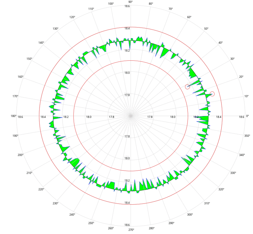
This uses clip methods. Basically, a clip acts as a window so that only things inside the clip shape will render. Different clips were needed for above and below the nominal. After the clip renderings are done, we can then then set the clip to the entire graphic, so we can finish it off as before.
Cgraph_with_highlight_2021-04-03_1727.zip (17.8 KB)
from java.awt import Color
from java.awt import GradientPaint
from java.awt.geom import GeneralPath
from java.awt.geom import Rectangle2D
from java.awt.geom import Ellipse2D

def scp(x, rawLo, rawHi, scaledLo, scaledHi, precision=0):
  m=(float(scaledHi)-float(scaledLo))/(float(rawHi)-float(rawLo))
  b=scaledLo-(rawLo*m)
  if precision<1:
    y=int(round(m*x+b,precision))
  else:
    y=round(m*x+b,precision)
  return y

def rect360(rho,theta):
	import math
	theta=float((theta-360)*math.pi/180)
	x=float(0)
	y=float(0)
	y=rho*math.sin(theta)
	x=rho*math.cos(theta)
	return x,y

dataIn=system.dataset.toPyDataSet(event.source.Data)
dataLength = len(dataIn)

if len(dataIn)>0:
  g = event.graphics
  print type(g)
  axes=GeneralPath()  # path for axes and major gridlines
  grid=GeneralPath()  # path for minor gridlines
  pen = GeneralPath() # path for data
  penColor=event.source.Pen1Color
  x=0         # Current x-ordinate for each pen
  y=0         # Current y-ordinate for each pen
  x1=0        # Storage for first x-ordinate for each pen
  y1=0        # Storage for first x-ordinate for each pen

  FirstPointFlag=0
  lowerInBound=float(event.source.LoGraphLimit)
  upperInBound=float(event.source.HiGraphLimit)
  precision=int(event.source.Precision)
  gapTime=event.source.GapTime
  if gapTime==0:
    gapTime=100000
  lowerRhoBound=0.0
  upperRhoBound=500.0  #Set size of graph
  center=500
  UpperXY=center*2
  UpperXYBound=UpperXY*1.05
  gOffset=(UpperXYBound-UpperXY)/2
  hourOffset=event.source.parent.parent.getComponent('Popup Calendar').HourOffset
  ccw=event.source.CCW
  startTime=event.source.parent.parent.getComponent('Popup Calendar').StartTime.getTime()
  penEnabledWord=event.source.PenEnableStatus
  penEnabled=[bool(penEnabledWord & 1),bool(penEnabledWord & 2),bool(penEnabledWord & 4),bool(penEnabledWord & 8)]
  index = 0.0
  minValue = None
  maxValue = None
  minValueX = 0.0
  minValueY = 0.0
  maxValueX = 0.0
  maxValueY = 0.0

#create data path
  for row in dataIn:
    if ccw:
      theta = 360-index
    else:
      theta = index

    rho=scp(row[1],lowerInBound,upperInBound,lowerRhoBound,upperRhoBound)
    x,y=rect360(rho,theta)
    if minValue is None or row[1] < minValue:
    	minValue = row[1]
       	minValueX, minValueY = x, y
    if maxValue is None or row[1] > maxValue:
       	maxValue = row[1]
       	maxValueX, maxValueY = x, y
    if FirstPointFlag==0:
        pen.moveTo(center+x+gOffset,center+y+gOffset)
		  # Store first point values to complete the graph
        x1 = x
        y1 = y
    else:
        diff=(index-lastTimeIn)/1000
        if diff > gapTime:
          pen.moveTo(center+x+gOffset,center+y+gOffset)
        else:
          pen.lineTo(center+x+gOffset,center+y+gOffset)
    if FirstPointFlag==0:
      FirstPointFlag=1
    lastTimeIn=index
    index += 360.0/dataLength
  # Close the loop
  pen.lineTo(center + x1 + gOffset, center + y1+ gOffset)


# create gridlines path
  for i in range(0,360,10):
    coord=rect360(500,i)
    axes.moveTo(center+gOffset,center+gOffset)
    axes.lineTo(center+gOffset+coord[0], center+gOffset+coord[1])
    coord=rect360(500,i)

# set graph scaling to size of the canvas
  dX = float(event.width-1)/UpperXYBound
  dY = float(event.height-1)/UpperXYBound
  g.scale(dX,dY)

#draw everything-- ;)
# draw background
  g.setColor(event.source.BackgroundColor)
  background=Rectangle2D.Float(0,0,UpperXYBound,UpperXYBound)
  g.fill(background)

# This section draws the highlighted areas

  #draw filled cirlce at Ideal Diameter, then use it to clip the next graphics
  # This lets us highlight the areas below nominal.
  radius = event.source.Diameter
  n=scp(radius,lowerInBound,upperInBound,lowerRhoBound,upperRhoBound*2)
  g.setColor(Color.GREEN)
  g.fill(Ellipse2D.Float(center-n/2+gOffset, center-n/2+gOffset, n, n))
  g.clip(Ellipse2D.Float(center-n/2+gOffset, center-n/2+gOffset, n, n))

  g.setColor(event.source.BackgroundColor)
  g.fill(pen)

  # set clip back to full graphic
  g.setClip(background)
  #Set the pen graphic as the clip area.
  g.clip(pen)

  # draw highlight cicles between max and nominal
  radius = maxValue
  n=scp(radius,lowerInBound,upperInBound,lowerRhoBound,upperRhoBound*2)
  g.setColor(Color.GREEN)
  g.fill(Ellipse2D.Float(center-n/2+gOffset, center-n/2+gOffset, n, n))

  radius = event.source.Diameter
  n=scp(radius,lowerInBound,upperInBound,lowerRhoBound,upperRhoBound*2)
  g.setColor(event.source.BackgroundColor)
  g.fill(Ellipse2D.Float(center-n/2+gOffset, center-n/2+gOffset, n, n))

# Reset the clip to the maximum area, and draw everything else.
  g.setClip(background)
  #draw pen
  g.setColor(penColor)
  g.draw(pen)

  # Draw nominal Cirlce
  radius = event.source.Diameter
  n=scp(radius,lowerInBound,upperInBound,lowerRhoBound,upperRhoBound*2)
  g.setColor(event.source.DiameterColor)
  g.draw(Ellipse2D.Float(center-n/2+gOffset, center-n/2+gOffset, n, n))


  g.setColor(event.source.AxixColor)
  g.draw(axes)

  # gridline circles
  for size in range(0,1001,200):
    if str(size)[-2:]=="00":
       g.setColor(event.source.MajorGridlineColor)
    else:
      g.setColor(event.source.MinorGridlineColor)
    g.draw(Ellipse2D.Float(center-size/2+gOffset, center-size/2+gOffset, size, size))

  #draw circle Tolerance Minus
  radius = event.source.ToleranceMinus
  n=scp(radius,lowerInBound,upperInBound,lowerRhoBound,upperRhoBound*2)
  g.setColor(event.source.ToleranceColor)
  g.draw(Ellipse2D.Float(center-n/2+gOffset, center-n/2+gOffset, n, n))

  #draw circle Tolerance Plus
  radius = event.source.TolerancePlus
  n=scp(radius,lowerInBound,upperInBound,lowerRhoBound,upperRhoBound*2)
  g.setColor(event.source.ToleranceColor)
  g.draw(Ellipse2D.Float(center-n/2+gOffset, center-n/2+gOffset, n, n))

  #draw min and max values circle
  diameter = 20
  g.setColor(event.source.ToleranceColor)
  g.draw(Ellipse2D.Float(center+(minValueX-(diameter/2))+gOffset, center+(minValueY-(diameter/2))+gOffset, diameter, diameter))
  g.draw(Ellipse2D.Float(center+(maxValueX-(diameter/2))+gOffset, center+(maxValueY-(diameter/2))+gOffset, diameter, diameter))


  # values around outer cirlce
  g.setColor(Color.BLACK)
  for i in range (0,36):
    x=(i*10)+hourOffset
    if x>360:
      x-=360
    if ccw:
      theta=360-10*i
    else:
      theta=10*i
    coord=rect360(515,theta)
    g.drawString(str(x)+u'°',center+coord[0]+gOffset-10,center+coord[1]+gOffset+5)

 # Axis values
  g.setColor(event.source.ValueTextColor)
  for i in range(5):
    n=str(scp((i+1),0,5,lowerInBound,upperInBound,precision))
    s=n+"0"*(precision-(len(n)-n.find(".")-1))
    #print "n= ", n , "s= ", s
    x=center+100*(i+1)+gOffset-(3+6*len(s))
    y=center+gOffset+10
    g.drawString(s,x,y)

    x=center+gOffset-(3+6*len(s))
    y=center+100*(i+1)+gOffset-3
    g.drawString(s,x,y)

    x=center-100*(i+1)+gOffset+5
    y=center+gOffset+10
    g.drawString(s,x,y)

    x=center+gOffset-(3+6*len(s))
    y=center-100*(i+1)+gOffset+10
    g.drawString(s,x,y)


