Hi All,
I’ve got a Chart component and populated it with data. That all works well.
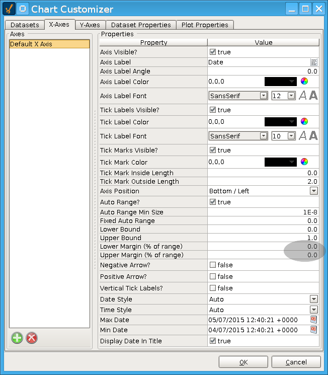
The problem is, there is a Gap on the left side of the chart before the data starts and a gap on the right side after the data ends. Is there any way to have the range of the chart match exactly the time period of the data so there are no gaps?

Awesome!
Thanks pturmel