As the title suggests, I have a time series graph with three trend lines, but for the life of me I cannot work out how to assign different colours to each line. I have three colour entries under defaultStyles/colours but all three trends just take on the first colour I specify. Any help would be great thanks.
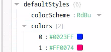
The Time Series Chart has a property called defaultStyles, which contains the option “colors”, which - by default - contains a list of 0 ([0]). If you click the plus button, add a value, and pick a color, the first trend will change colour.
Props:
Graph:

This is after using the default settings of the Time Series Chart. If this doesn’t work in your current Time Series Chart, but it does in a new component, check which changes you made and see which might have had the effect.
If you want, you can share your component and I can try and help.
This setting does work on the default graph, but my graph is set up differently. The default graph has the two data sets nested in a single “series” element, where one data point has a time stamp and then the value for both temperature and pressure. My graph instead has three different data series, as I am trying to show three tag histories. I then show the actual data using three trends, as trends allows the data to be shown as a step which is my goal.
Thank you for clarifying. I think your question was answered in this thread a few years ago:
In short: You have created three trends. In each trend, you create one Column for each key in your data (in your case - two, Temperature and Pressure)

This results in the following plot:

( In hindsight, I could’ve picked more distinctive colors, but I hope I helped you out nevertheless)
I see, thanks for that. I ended up just changing it from three trends to three data points, which was more finicky with the tag bindings but did allow me to use the defaulstyles to configure three different colours. I will be sure to try this approach, thanks.
I have been through this, and the easiest way I found to resolve this was to combine all of my series into just 1 series using a transform on my data binding. Each line will be associated to a different column in your dataset.
From here, you want 1 plot with 1 trend and 1 axis that all match up, like in the screenshot. The trend needs to point to your series name and your axis name.

After that, near the bottom of the properties, there is a dropdown for color scheme with many options available, which makes customization pretty easy.

Unfortunately this doesn’t work for my application as I have multiple axis, one left and one right, which means that I cannot combine all the data into one series as then there would be no way to assign both axis. This means that for both series, they have the same colour, which seems like quite a design oversight.