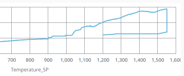
I have a XYChart in Perspective, X axis data is temperature of the kiln, it have a rise stage and drop stage, so the temperature data on X axis are duplicated, and it causes the curve to display to the left (it should display to the right like a mountain peak), below is the screenshot, how to fix this problem?
Are you trending the temperature over a time period? Normally the X-axis is time and the Y axis is the value. I would probably use a time series or power chart for this
as felix said, you'll have to come up with a way to make your X-axis timebased. Or add a second Y-Axis that is the temp, and have your X-axis be purely time. X-axis has to be sortable...