Try pasting this view into Project Browser → Perspective → Views.
DIY Split Container JSON
{
  "custom": {
    "split": 50
  },
  "params": {},
  "propConfig": {
    "custom.split": {
      "persistent": true
    }
  },
  "props": {
    "defaultSize": {
      "height": 272,
      "width": 690
    }
  },
  "root": {
    "children": [
      {
        "meta": {
          "name": "Slider"
        },
        "position": {
          "basis": "32px"
        },
        "propConfig": {
          "props.value": {
            "binding": {
              "config": {
                "bidirectional": true,
                "path": "view.custom.split"
              },
              "type": "property"
            }
          }
        },
        "props": {
          "style": {
            "paddingLeft": 10,
            "paddingRight": 10
          }
        },
        "type": "ia.input.slider"
      },
      {
        "children": [
          {
            "meta": {
              "name": "EmbeddedView_L"
            },
            "position": {
              "basis": "20px",
              "shrink": 0
            },
            "propConfig": {
              "position.grow": {
                "binding": {
                  "config": {
                    "expression": "{view.custom.split} / (100 - {view.custom.split})"
                  },
                  "type": "expr"
                }
              }
            },
            "props": {
              "style": {
                "borderColor": "#0B479C",
                "borderStyle": "solid",
                "borderWidth": 1,
                "margin": 8
              }
            },
            "type": "ia.display.view"
          },
          {
            "meta": {
              "name": "EmbeddedView_R"
            },
            "position": {
              "basis": "20px",
              "grow": 1,
              "shrink": 0
            },
            "props": {
              "style": {
                "borderColor": "#0B479C",
                "borderStyle": "solid",
                "borderWidth": 1,
                "margin": 8
              }
            },
            "type": "ia.display.view"
          }
        ],
        "meta": {
          "name": "FlexContainer"
        },
        "position": {
          "basis": "200px",
          "grow": 1
        },
        "type": "ia.container.flex"
      }
    ],
    "meta": {
      "name": "root"
    },
    "props": {
      "direction": "column"
    },
    "type": "ia.container.flex"
  }
}
Notes:
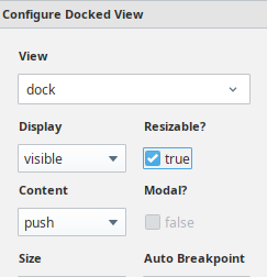
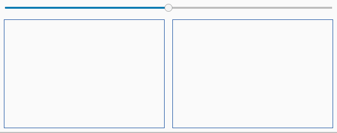
- The view is a flex column.
- The slider has a bidirectional binding to the view's
props.custom.split. (That avoids messy and brittle bindings from the next step.)
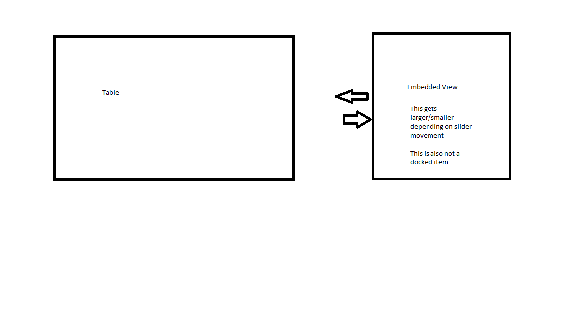
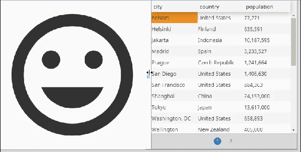
- The slider is followed by a Flex Row into which two Embedded View components are added. They have the following settings:
position.shrink : 0
position.basis : 20px (Set this to whatever minimum width you want.)
- The relative weights of the
position.grow properties determine the relative widths of the embedded views. For simplicity we set the one on the right to position.grow : 1.
- The embedded view on the left has its
position.grow calculated by an expression binding:
{view.custom.split} / (100 - {view.custom.split})
So, if the slider is at 75 of 100 the result is 75 / (100 - 75) = 3 giving us a 3:1 ratio between the views.
If the slider is at 25 of 100 the result is 25 / (100 - 25) = 1/3 giving us a 1:3 ratio between the views.
I suggest binding the slider's props.trackColor to its props.railColor and specifying a neutral color for the rail. Having different colors each side of the slider knob (as in my animation) doesn't make any visual sense in this application.
Have fun.