I’m struggling with the Easychart. I have historian data that is this: 3 tags that are totalizers for one piece of equipment at the end of each shift (Shift 1, Shift 2, and Shift 3.) Each of those tags writes at the end of the shift (6am, 2pm, and 10pm). I have my tag history resolution set to “Raw”. When I have any one of these on the chart it works fine. But if I have more than one, it plots a point for EACH pen at EACH time. For example, even though there is only data for Shift 1 at 2pm, it will show a point (duplicating the data) at 10pm and 6am, since those are the points that the other pens use. My question: how can I make each of my pens only show the actual data for that tag? Why is it plotting every tag at any time interval that has any data? Thanks for your help!
Because the tag historian is designed to show the value of tags at requested times. Those tags still hold values at those times, so the historian displays them. You are trying to use the tag historian as an event recorder. It isn't built to work that way. You should be using a triggered transaction group, or scripting the writes to a custom DB table.
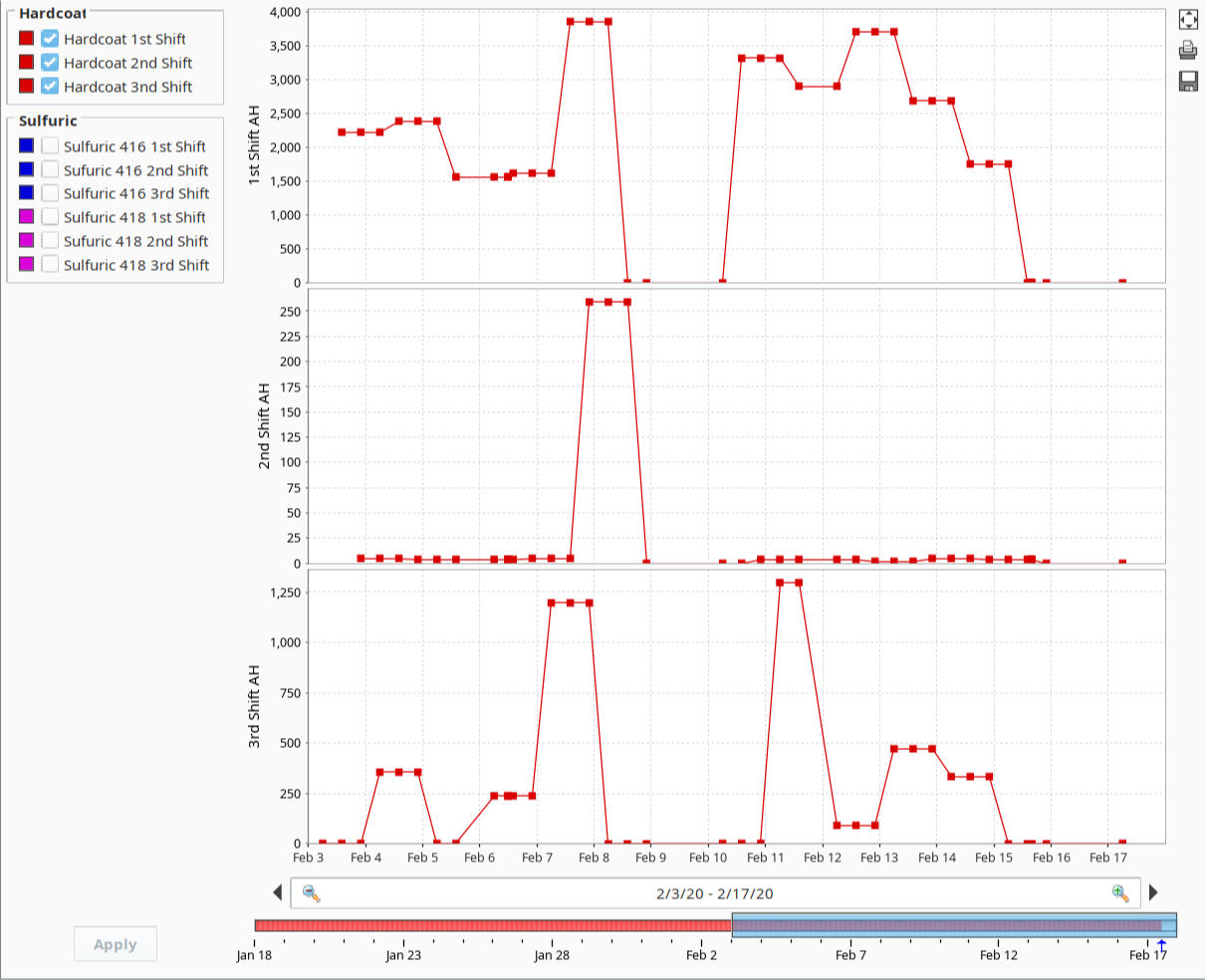
Thanks for the explanation, that’s very helpful. I think I understand what you’re saying, but here’s my follow up question: I don’t believe that the tags hold values at the other times. The PLC is only sending 1 data point per day per tag, we’re doing all the calculations and totalizing at the PLC. So the historian only gets 1 value per tag per day. This shows up correctly when I have them in a table by themselves. It’s when I put multiple ones on the same chart (or even different plot of the same easy chart), that it will put a data point at every single interval for every single tag. So in the screenshot above, the top chart is correct and that’s just for 1 tag. The bottom one is when I have all 3 shifts on the same chart, and you can see that the same tag (top plot) now has 3 data points on the graph per day (all identical values - but now at the times of the other tags on the other plots).
Maybe I didn’t fully get what you were saying, so sorry if I misunderstood. Here is a table of the raw data (there is one duplicate - when the PLC resets it sends another value on restart), but on the chart every value gets replicated for all 3 shifts.
No, that’s not my point. Look at the live tag value at any time. It holds the last value the OPC server delivers until it is replaced the next day. The tag history system is replicating that reality–your dataset has a timestamp for a row and that tag has a column, so the intersection of row and column is showing the tag value thought to have been there at that timestamp. You are trying to make it behave as an event recorder. It doesn’t work that way.
Got it, now I think I understand more fully the issue, especially with the rows and columns and putting a value it believes to be at that time stamp. I have a lot to learn about this system…it behaves very different from other data visualization tools I’ve used.