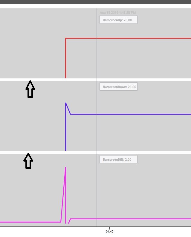
I will be building several time series charts for the client who prefers to have multiple plots on the same chart as opposed to one chart with several different axes. Is it possible to set a background color per plot like I’ve done manually in the screen shot? (used a label component with background filled in set behind the chart)
Also, as a “nice to have” would be the ability to add padding between the charts to setup more division of the plots. This is especially useful with multiple plots when the background of the whole chart is the same. It becomes tough to distinguish the bottom of one plot from the top of another.
Thanks
Right now, there isn’t a way to do that. I will open a feature request.