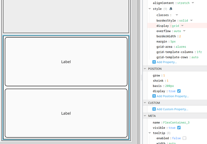
I am working on designing mimic pages using grid style classes instead of the usual flex container method. I have two labels which represent high alarm and low alarm and I want them to be displayed on top of each other similarly to “running” and “healthy” above, the issue is not with the “area-name” style property on each label as I have already checked that. What I’m looking for is help identifying my style classes in this screenshot to deduce why my two labels aren’t stacked on top of each other, thanks
Open it in your browser, Use F11 developer tools to inspect like you would any other web application.
It looks like your area definition doesn't align with the column and row definitions.
You have 4 columns and 2 rows defined in the areas, but you have defined 3 columns and 4 rows.
Have a look at this site for some help on CSS grid.
It would help if you posted a wireframe of what you are trying to achieve. To me it looks like you want two stacked labels which would work really well with a standard flex container.
If you want to use grid then you can set this up without defining any areas.
{
  "display": "grid",
  "grid-template-columns": "1fr",
  "grid-template-rows": "auto"
}
If you want to limit the size of those object so they don't grow with the screen then you can replace the auto rows with defined row sizes "grid-template-rows": "60px 60px"
Here is an example using the area labels to position the objects.
Note I have defined 2 rows and 4 columns in both the areas, columns and rows


