Hey,
I have these trend graphs where each color represents how far a system deviates from a setpoint. The deviation is scaled from -1 to 1, with darker colors indicating a greater distance from the setpoint.
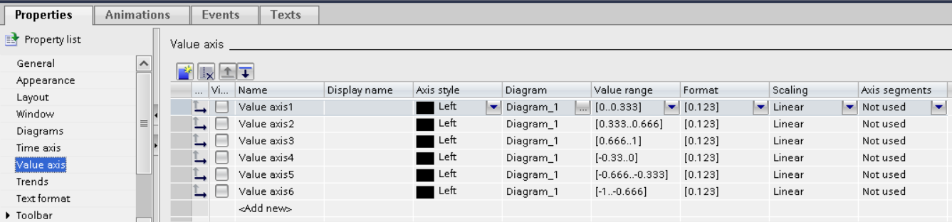
In WinCC Professional, I previously achieved this by creating six separate trends of the same value, each with its own axis. The axes had specific Value Ranges so that the individual trends could be stacked visually as shown in the image.
I am now trying to replicate this in Ignition Perspective, but I’m running into an issue: the charts overlap instead of stacking, and the colors do not “take over” from the previous color as intended. In other words, the visual segmentation of deviation levels is not working the same way as it did in WinCC.
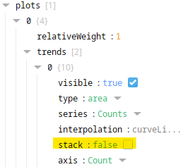
I have tried with some timesseries charts with the area type but with no success. Do anyone have any good tips to point me in the right direction for achieving this.
Thanks in advanced ![]()
WinCC Example