Hello everyone,
Does anyone know the best way to go about adding a highlight overlay for a specific time interval to an easy chart? It should look something along the lines of this image below. A bar or something at the top would do aswell, I just need something to bring attention to a specified time interval.

Thanks.
I don’t have a reference handy on this (I’ll probably circle back to this later and fill in the details) but to get you started, you’ll need to use the configureChart extension function to drill into the chart’s XYPlot, which has an addAnnotation() method. You can pass an XYShapeAnnotation into that method, which you will need to create yourself using a basic Java Shape (eg, Rectangle2D).
addAnnotation() should work. It looks like it takes an object that implements XYAnnotation. I tried importing org.jfree.chart.annotations.XYShapeAnnotation but the import path was invalid. Do you know how to find the import path for these XYPlot objects?
What does your import statement look like?
This appears to work for me:
from org.jfree.chart.annotations import XYShapeAnnotation
I may have misspelled something. That works fine for me now.
It seems to be adding the overlay without an error now. The problem is that it does not appear on screen. Is there anything else that needs to be done to make the box show up?
	from org.jfree.chart.annotations import XYBoxAnnotation
	from java.awt import BasicStroke, Color

	stroke = BasicStroke(1)
	outline = Color(255, 0, 0)
	fill = Color(0, 255, 0)

	overlay = XYBoxAnnotation(10, 10, 100, 100, stroke, outline, fill)
	chart.getXYPlot().addAnnotation(overlay)

	print 'added overlay'
Try specifying the X coordinates as epoch milliseconds, rather than 10/10.
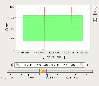
Ah, I was thinking it would be pixels. That is a much better interface anyways. I got it working with this code for future reference.
	from org.jfree.chart.annotations import XYBoxAnnotation
	from java.awt import BasicStroke, Color

	stroke = BasicStroke(0)
	outline = Color(0, 0, 0)
	fill = Color(0, 255, 0, 127)

	minuteOffset = 60000
	startX = self.startDate.getTime() + minuteOffset
	endX = self.endDate.getTime() - minuteOffset
	bottomY = 20
	topY = 80

	overlay = XYBoxAnnotation(startX, bottomY, endX, topY, stroke, outline, fill)
	chart.getXYPlot().addAnnotation(overlay)

	print 'updated overlay'
Do you know when the configureChart() function is invoked?
configureChart gets fired a couple different places, but basically you can rely on it getting fired any time your chart’s data changes.