The strategy is not clear to me.
I wanted a label to be accented and emphasized.
How do I define the color such that, the desired style objective remains the same, even when changing theme?
If I prefer specific style, for each defined theme? How do I do this?
Is there a topic I can google to learn about this UX strategy?
I'm not sure what this means, but in general try to use the Perspective Built-In Themes | Ignition User Manual. If you use the built-in theme colors such as --success or --error then they follow the colors as shown on the referenced page.
If you want to define your own then you need to add a custom theme for each of the built-in themes as described in Creating and Using Custom Perspective Themes | Ignition User Manual.
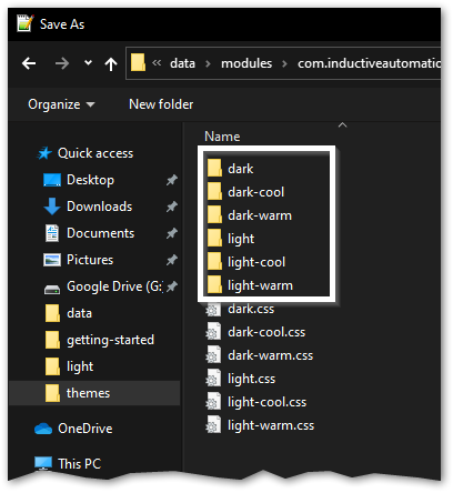
Note that you don't modify the stuff inside the folders. These get overwritten on each version upgrade. Read the doc!
For example, I want to keep label’s font style accented, emphasize for each theme.
On light theme, if I hard code the font color to be darker. When dark theme is selected, the font will be hard to read.
Don't hard code.
- Create a Style class that you will use on all similar components.
- Set the font color to a CSS variable such as
--neutral-20 or --success.1
- Set the background in the style class to
--neutral-90 (or whatever).
- Apply the style class to the component.
Now change your theme and watch the components change and retain high contrast.
Load an ignition page in your browser, hit F12 and scroll to the bottom of the CSS pane. There you will see all the theme color definitions.
1 When using theme colors in style definitions you need to use the var() syntax. e.g., var(--callToAction). This is documented in Perspective Built-In Themes | Ignition User Manual.