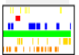
I want to replicate the horizontal color bar chart based on this data table. The data table shows when each color was activated, and each color has a number assigned (lime=1, blue=2, yellow=3, etc.). Can I do this in an XY Chart?

I don’t think so. I would create a single view with a parameter number indicating what color its background should be (so just a small rectangle representing a single slice). Then create a view representing one vertical slice that is a row repeater of the values in that slice. The overall view would then be a horizontal repeater of the vertical slice view.
You'll have to do some processing to your data, but you can make these types of charts using the XY Chart component. See my Ribbon Chart exchange resource for inspiration:
Play around with this idea:

- Each plot will need its own y-axis.
- Pick your column from the dataset.
- Set the line color to transparent.
- Set
interpolation : curveStepAfter. - Set
type : area.
Repeat for each ribbon. (Actually, get the first one right and then right-click, duplicate and edit.)
The trick of this is the combination of curveStepAfter, area type and no stroke results in blocks on the ribbon.
Have fun.