In Diagnostics > Overview > Performance, the memory indicator turns red at 50% usage (e.g., 4/8 GB).
As I understand it, this serves no real purpose since a sawtooth pattern in the below 40 - up to 90% range is normal. The red highlight doesn't indicate an issue—you still need to check the usage pattern itself.
I’ll look into seeing what we can do to better reflect potential issues in this space.
Is it possible to wait for the memory value to remain above 90% for a period of time and then change the color? That would be a better indicator that something is wrong, as the sawtooth would normally repeat pretty quickly.
FWIW this coloration issue exists in its own capacity in 8.1 as well.
Short answer: Absolutely.
Long answer: But not on the front-end, where ALL displayed data is based on the most recent response from the back-end. In order for us to properly convey a warning state based on anything other then point-in-time data, the back-end needs to inform us that the system is in such a state. The proper fix is likely an additional field as part of the overview response we are using to build that UI.
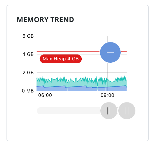
Would a sparkline work better here for the memory usage instead of a pie chart? If the purpose is to provide reflect the current health of the system, a sparkline would be able to show the sawtooth pattern (or lack of).
You have that available on the Performance page: /app/diagnostics/performance
The field in question is meant to be a “quick” indicator as opposed to the more in-depth chart.
I am aware of the one on the diagnostics page, but I was thinking one even simpler for the performance overview. Just enough to show the general shape of the memory trend, no axis, no gridlines.
I guess this gets into the challenge of the simplest way to articulate the system status, with minimal screen space available.
It really does. The Overview page with the indicator in question is really just meant to be an at-a-glance page and charts really require a more devoted, concentrated effort to fully understand what you’re being shown. Our designs focused in part on keeping complex UI out of the Overview pages.
We’re going to approach this with two efforts:
- 8.3.3 (target) (IGN-14693): Bump the threshold for displaying the warning indication to 90% consumption in an effort to reduce how often a warning would be seen.
- Long-term (untargeted) (IGN-14691): Have the back-end determine when the warning indicator should be used.
The first phase - where we bump the critical warning threshold to 90% memory consumption - was merged into the 8.3 code line a few days ago, and can be seen in 8.3 nightly builds.