Hey all,
I have two Gateway servers currently (8.1.15 and 8.1.18) and the problem I am experiencing is with 8.1.18. I am unsure if something with the component in the backend has changed, but I am no longer able to search through a dropdown list by typing like I was able to in 8.1.15:
I typed ‘0904’ and I was able to instantly select the item. Same thing with ‘0906’
8.1.18:
I tried the same thing as above, and it only scrolled down when I typed a number or letter that those items began with. All the items began with a ‘0’, so everytime I hit a ‘0’, it scrolled down one item instead of trying to find an item with the list of characters I typed.
I am not sure if this is a bug or a feature that has changed, either way, I think it would be kind of redundant to program a script for every single dropdown component I have (50-100 in one project out of ~10 projects).
Any help is appreciated!
The ‘search like’ functionality was deliberately removed because it was buggy (in particular, typing a space would ‘reset’ the search buffer, leading to unexpected results). However, you’re not the first person to complain, so we may end up reverting that change and accepting the occasionally buggy behavior.
For context, the KeySelectionManager that drives this logic is very deliberately written to only allow single-character selection, not searching based on a buffer: JComboBox.KeySelectionManager (Java SE 11 & JDK 11 )
Ahhh I see; that would explain everything. Maybe have a property to enable/disable ‘search like’? I am sure there are some who don’t necessarily need this functionality, but then on the flip side there are those who have huge lists of data and would benefit from a feature like this.
Anyways, thank you for the quick response so I didn’t go down a rabbit hole trying to solve this!
Hi there,
Since upgrading from version 7.9. I have had many users ask about this topic. We have many vision dropdowns where this ‘search like’ feature worked great for my users to be more efficient at entering data. I would really like to see this feature come back in some form.
Thanks!
I’ve created an internal ticket (you two aren’t the first who’ve asked) to see if we can revert to the original behavior without some of the other drawbacks that caused it to change in the first place.
Is there any update or estimated time on this request?
The revert was done recently; I'm not sure the exact version but I believe 8.1.23 will have it; possibly 8.1.22.
@paul-griffith whether this issue fixed in 8.1.23?
It's back and as far as I can tell, it is behaving the same as before.
This seemed like an interesting problem, and I had the night off, so I fiddled around with this and developed a prototype searchable combo box:
Version 2 with auto complete and preview selections options enabled and auto resize behavior disabled:
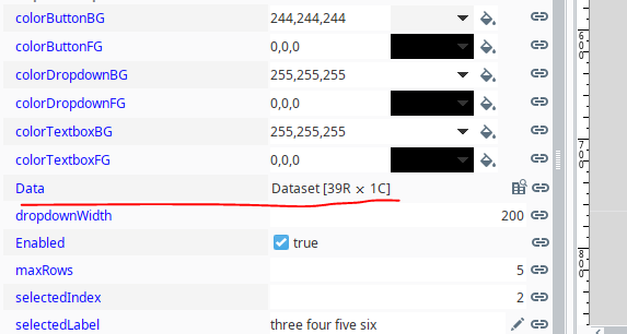
While I was at it, I made all of the colors for the dropdown, textbox, and button all independently accessible:

I also added a maxRow property that makes the number of rows displayed variable:

...and the width of the dropdown automatically adjusts to the width of the text
Just in case anybody else wants to play around with this and develop it further, here is the working prototype:
prototypeSearchableDropdown.zip|attachment (7.2 KB)
searchableDropdown_v1.014.zip|attachment (7.6 KB)
searchableDropdown_v1.019.zip|attachment (8.6 KB)
searchableDropdown_v2.0.zip|attachment (9.9 KB)
searchableDropdown_v2.01.zip|attachment (10.0 KB)
See the current exchange version for all future updates
Update: v1.014
• Added support for all datatypes
• Restructured code, so the dropdown will populate and function no matter how many columns are present
• Corrected focus issue that would occasionally cause the first letter to be deleted when typing
• Improved data validation, so if the text is edited, and it no longer exactly matches a dropdown selection, the selected index and selected values get set to -1 and the selected label gets set to None
• added clearTextOnClick option that, if selected, will automatically clear the text from text field when the component is initially clicked on.
• Set the minimum width of the dropdown menu to the width of the dropdown itself. The dropdown menu will still automatically widen if the text is wider than the component, but if it runs out of room, a horizontal script will appear.
Update: v1.019
• Added autocomplete option
Update: v2.000
• Added up arrow, down arrow, page up, and page down functionality
• Refactored code for improved efficiency
• Added mouse listener to dropdown to highlight the item the mouse is hovering over
• Added custom properties for changing the foreground and background colors of the selected row in the dropdown
• Added preview selection function
Update: v2.001
• Added escape key functionality to close the dropdown window
• Added an auto resize option that when selected causes the dropdown menu to remove whitespace from the dropdown whenever the number of selectable rows are less than the maxRows parameter.
• This version has been published on the exchange.
Updates v2.02 and v2.03
Are you using any project library script?
Its missing in your zip file you have attached
No; everything is self contained, and I've imported the template and tested it on multiple systems, but that said, I'm sure there is a lot of room for further development.
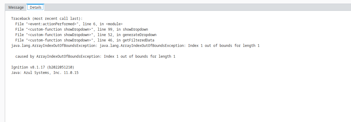
Are you getting some kind of error?
yes getting error
tested in ignition 8.1.17
passed dataset
error
whether i missing something?
Yes. The way this dropdown is designed, it requires two columns: Value and Label. Value is an integer, and Label is a string. If you need it to work in some other way, the script will need further development.
The core script is a custom method on the text field component.
Edit: The above statement is no longer true. See update notes
Oh ok fine.. thanks for the input
The searchable dropdown component that was originally prototyped here has been further developed and published on the exchange:
Features that have been added that were not present in the original prototype:
- Added support for all datatypes
- Restructured code to populate and function properly no matter how many columns are present
- Corrected focus issue that could delete the first letter when typing
- Improved data validation to reset selected index and values if edited text no longer matches a dropdown selection
- Added clearTextOnClick option so the clear text field on click is optional
- Set minimum dropdown menu width to width of the dropdown component
- Added autocomplete option
- Added up/down arrow, page up/down, escape, and enter key functionality within the dropdown menu itself
- Refactored code so the dropdown menu component is not recreated every time the user types
- Added mouse listener to highlight dropdown item on hover
- Added custom properties to change selected row foreground/background colors
- Added preview selection function
- Added auto resize option to automatically remove whitespace in dropdown menu when the list is shortened by filtering
Version 2.02 Improvements:
• Changed the way strings are handled, so special Unicode characters and Unicode characters from other languages can now be displayed and searched for in the dropdown. Example: áéíóúÁÉÍÓÚñÑ
• Corrected a bug that appeared when there is only a single column of string data, so the selected value does not become the row index of the filtered data rather than the selected index of the entire dataset
• Refactored code adding a setSelectedValues custom method to eliminate a point of redundancy that was discovered
• Added automatic integer conversion to string values in the value column if the string values are numeric
• Added a selectedStringValue property, so that unconvertable non-numeric value column selections can be represented by a externally accessible property
Version 2.03 Improvements:
(Improvements based on user feedback and implementations)
• When writing to the selected index, label, value, or string value properties, the system will automatically update all relevant elements, assuming that the provided information is a valid member of the dataset. If the information is not valid, the attempted write operation will be removed.
Example: Writing a value of 6 to the selectedIndex property will automatically update the selectedLabel, selectedValue, selectedStringValue, and the actual text that is typed in the dropdown (if there is an entry at index 6 in the primary dataset).
• While typing, the moment the text matches a label in the dataset, the selected label and associated properties will update accordingly without the need for further input.
• In previous versions, changing the data in the designer while not in preview mode could result in either an index out of bounds exception at run time or the selected value being displayed in the textfield instead of the selected label. This could only happen if the number of columns changed to less than two or to greater than one. The list click listener was updated, so it determines the label index at the mouse click event instead of at its initialization.
• Refactored and corrected regression in passFocus custom method that allowed the dropdown button to gain focus when tabbing
• Added keyPressed and keyReleased custom properties that receive the keyCode from the text field's keyPressed and keyReleased events. They will fire a propertyChange event every time a key is pressed or released making it possible to do custom key event scripting from a specific template instance without having to add a listener at run time
• Added clearSelectionsOnDataChange option that makes clearing the selected values, label, and text optional any time that the dataset for the dropdown is replaced via binding or scripting. In other words, if this option is deslected, and the Data property for the dropdown is updated, the selected label, values, and index will properties at the time of the update will remain unchanged
• Dropdown font matches the textfield font, and automatically scales with the the textfield font when the searchable dropdown component is resized.
• Added the option to highlight text automatically on focus gained
Update: Version 3.00 Improvements:
• A searchable table mode was added that shows all columns to the right of the value column inside the dropdown menu
• The column widths automatically size to the text within the columns or proportionally adjust up to an adjustable max width property.
• Showing the table header is individually selectable, and both the header color as well as the header text colors are individually selectable.
• In cases where the value label columns are not unique, but other columns are, the dropdown now has the ability to differentiate selection based on the additional data columns regardless of whether or not it is in table mode.
• The predictive text feature now starts predicting on the very first character instead of the second.
Update: Version 3.01:
New Properties:
alignHorizontalLeftalignHorizontalRightdownArrowAutoScalefontBoldfontFixedSizeEnablefontFixedSizefontItalic
Bug Fixes:
- Fixed an issue where the down arrow icon would turn into an ellipsis when the searchable dropdown was resized too small.
- Resolved a bug that prevented selected fields from being written to immediately after the data property changed during initialization.
- Added a missing break in the text prediction loop, so the predicted [auto complete] text is now the first item in the list instead of the last while typing
Updates:
- Removed horizontal font scaling. Users can now create narrow instances of the dropdown without the text appearing too small. The auto font scaling will now solely depend on the dropdown's vertical size.
Detailed Property Descriptions:
Alignment Properties:
alignHorizontalLeft: When set to True and alignHorizontalRight is False, it aligns all text to the LEFT.alignHorizontalRight: When set to True and alignHorizontalLeft is False, it aligns all text to the RIGHT.alignHorizontalLeft & alignHorizontalRight: If both are set to True, text is aligned CENTER. If both are False, alignHorizontalLeft is set as the default at runtime.
Note: Alignment properties affect both the text field and the dropdown.
Font Properties:
fontBold and fontItalic: Enables BOLD and/or ITALIC font styles for the text in both the text field and the dropdown.fontFixedSizeEnable: Disables font scaling and enforces the use of the fixed font size.
Button Icon Scaling:
downArrowAutoScale: When enabled, the down arrow icon size scales with the button at runtime. If set to False, the down arrow maintains a fixed size.