Identical tag history deadband settings with identical pen settings displays differently on the same Easy Chart with tag history interpolation allowed depending on whether the source is the Internal Historian (formerly Edge Historian) or an external historian (in this case a remote historian using an external SQL DB on another gateway). The two pens are plotting the same tag value (duplicate OPC tags), one to the internal historian and one to the remote external historian (not a remote internal historian).

The tables above show the raw values as stored in the two historians, internal on left and remote external historian with SQL DB on right. Ignore the several second time difference between historians (one was at 2 second sample rate, and the other at 10 second sample rate). 11:13:34 on the left corresponds with 11:13:36 on the right. For this and the next four records in both historians, the tag history settings were identical as below (except for sample rates as noted above):

If we turn off Easy chart tag history interpolation, both pens plot as expected. But this setting makes some faster changing analog values look terrible (steps) as without interpolation they plot the last value over and over again for each sample of other tags in the chart where the analog value didn’t have a sample due to deadband. As a workaround we reduced the maximum time between samples for the tag stored to the internal historian:
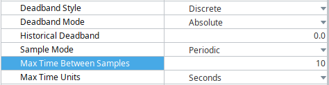
This is how we got the red line to plot as expected for the dip around 11:40 on the chart shown above (at that time it was set to 6 seconds, later reduced to 10 seconds as shown in last screen clipping). This solves the display problem, but stores a lot of redundant records between feed rate changes.
Is there anything we might be missing, or is this just a bug in the internal historian?