I edited the json above, not sure what I all had copied between yours and what I added, but it didn’t work for me on a newly dropped apex pie chart either… If I add a new one to the view, change the type to radialBar, copy the json above and paste it on options it works for me.
I’ve also found that entering/exiting preview mode updates the changes made to the apex charts.
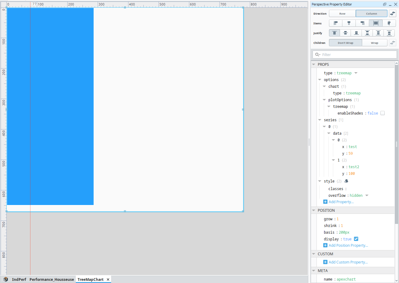
Ok, next question, Javascript-related. Complete Javascript n00b here…
For the total of a RadialBar chart, how does this javascript formatter function below work to sum all of the series values up?? (edit: This explains this particular question: Array.prototype.reduce() - JavaScript | MDN)
Where does “w” come from (and where does “val” come from that I see in other examples)? I thought this might have just been some made up variable name, but nope, changing it kills the component
Where do I find the doco for “w” and “val” for its methods and properties?
Are there any other variables (or arguments, or whatever they are in javascript) available?
function (w) { return w.globals.seriesTotals.reduce((a, b) => { return a + b }, 0) + ' kW' }
Edit:
I found this, but it’s vague and doesn’t fully document everything… still trying to find the full doco for it!!
formatter: function(val, opts)
The formatter function allows you to modify the value before displaying Example:


  formatter: function(value, { seriesIndex, dataPointIndex, w }) {
    return w.config.series[seriesIndex].name + ":  " + value
  }

In the code above, seriesIndex is useful in multi-series chart, while dataPointIndex is the index of data-point in that series. w is an object consisting all globals and configuration which can be utilized the way mentioned in the above code.
Addtionally, how can I change the max of the radialBar from 100 to something else?
Edit: That’s a no, derp… it looks like I’ll have to convert the series values to % and then convert them back into real values by reversing the formula in the values display formatter
Edit:
Hmm, it doesn’t look like I can bind to a formatter. I have a feeling the chart initialises and uses the formatter that the chart initially has and if this changes by binding, it’s not then updated in the actual chart. I think I would need to call an update on the chart to re-initialise it which I can’t do without having access to such a method via the module I wanted to use this in a dashboard component so I need the formatter to be created based on what it’s being used for… Any ideas?
I am struggling to get the line graph to work with a basic tag history binding. I am running 8.1.18 and 1.0.9 of the apex module. Below is my config and then the resulting chart.
Bug report:
When the trial version finish if I open a view that include APEX chart with history binding for data, the view is getting very slow and freeze.
Another question on this module. Under options>chart>events there is an option for a "beforeResetZoom" event, however when I go to set up a component event that is not one of the options. I am missing something or has that event just not been added. If it is the latter, if there anyway somewhy has come with to know when the zoom level has been reset?
I have been messing around made some good looking graphs, ty for the developers. However I have been having some problems with launching it from a gateway which is on a remote linux gateway.
When launching the session from gateway (no IP in URL) then I get a following error:
"/res/kyvislabs/Components.css?no_cache=1678455960141"
However when I start session from the designer, everything works fine.
I have tried to restart the Gateway to update path, but no success. Gateway version is 8.1.25
Any ideas?
Edit 1:
Basically the session doesn't load in the resource from the server (taken from server)
Just found this and I think it's great! Solves a few issues that I have with the built in charts.
Though I have a few issuse with this as well. After some searching I noticed that it seems like these are fixed in version 3.37 (in perticular this one: #3483 Fix x-axis tick alignment).
When do you think this will get merged into the module?
Is there anyway to display the annotations from the tag historian on an apex chart? There is some functionality and customization that I need that seems to be lacking in the Perspective Power Chart.