I was asked to change one of the graphs that we are using to now display a threshold area where the target is within two numbers. Prior to this it was just above a certain number would be at target, and I had just used a single line across the chart (first plot on Day 1, last plot on the last day of the month) both at the target number, and then fill down in the red color. But now, they want an UPWARD fill above a higher target too.
Previously the “meeting target” area was just left with no fill, meaning if it was above the line, it was effectively white, and below the line was red. Currently, if I use that method to add a second line and then try to color that green, the green blends with the red that was under the bottom line and turns it into a new color.
Is there a simple way to do this in Ignition? Without blending the colors, and with an upward fill?
Screenshots are (1) what I’m being asked to change it to, (2) previous without high threshold, (3) adding in the high threshold using the same method I used to add the low and now it’s got a blended color, (4) the properties for the fills
I see a fill color of #6CA46280 with opacity of 5.
The 80 at the end of the color is opacity, so if you drop that, it will be completely opaque (actual opacity value need not be greater than 1). Not sure if that would fix your problem, but it should keep it from blending with any color beneath it.
That unfortunately didn’t really do much. The colors are still blending (just not as much, and only because I have the opacity of the green lower than that of red, but it just makes it harder to see that there’s any green between the lines). If I increase the opacity number for the green, it just adds more green to the blend of red and turns the red that much more of a red-green blended color.
Unless you make it completely opaque, then it will blend... 
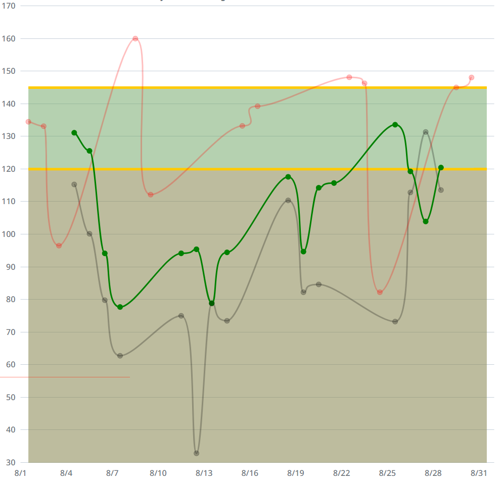
I would push them towards changing the individual points colors based on the range.
Something like
I would do that, but the three lines we have on the chart already require the colors as they are because they represent the different shifts within the facility.
I mean you can set the colors of the individual points on each line to represent out of range specs.
In the image I posted, the green line is goal, the other is the actual values, if it is below the goal the point is red, if above goal it is bright green.
Each of your lines could be done with that, just would be an inside range, instead of above range.