Hello, I’m trying to recreate the effect that you get when you hover over a button with things other than a button (like a Label, Numeric Entry, etc). My hope is to create a class that I can apply to components, but if a little CSS is required that’s okay. Either way, help is appreciated!
Effect Desired: Drop shadow behind hovered item.
(Not pictured: cursor, but easily applied from style class).

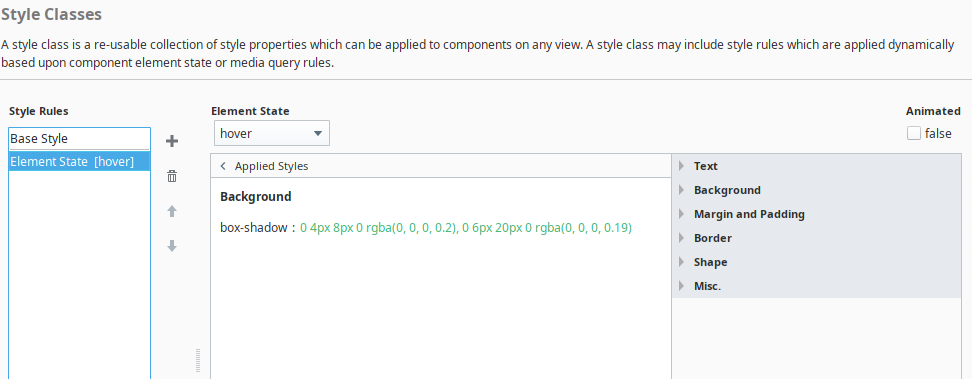
In Perspective styles, I have a folder named hover. In there I create styles to add to components that I want to apply when hovering. The style rule is Element State [hover] then I simply create the style to apply on hover as shown below.
Then you can apply it to a component under style classes.
I should’ve added that I do know how to add the hover state in the classes, I needed help with the shadow-box values but this will be a great resource for anyone who finds this in the future.
Thank you for the help, your class values ended up being exactly what I needed! 
Here is a css generator tool that will probably come in handy.
Box Shadow CSS Generator | Web Code Tools