Oh! My project doesn’t have your Perspective Style class in place, so I’m not seeing the effects of that Style Class. About a third of the way down the Styles tab, there is a line which reads as “Inherited from div.psc-Page…” This tells me that there is a Perspective Style Class applying changes, which are overriding the applied theme.
Please keep in mind that CSS is done in order of specificity, so Perspective will apply settings from the theme, then from Perspective Style Classes, then from in-line style properties.
On the root node of your View, remove the “Page/Page” class.
Oh! Well that makes perfect sense. Is that class automatic with a default home page on a new project? It very well could have been someone else who added that style class when creating the page. This project was started when perspective first came out and I am just now beginning editing.
Thank you for all your help. you guys do an amazing job. Keep up the good work!
I’m not sure if this is a result of something we’ve done or a side effect of theming/updating to 8.0.14. I recently updated from 8.0.10 and am a little confused by some of the visual issues I am encountering due to changes. Some things may be intentional, bugs, or perhaps we had something screwed up with our theme files. I don’t recall us doing anything with them, but I could be wrong. I’m looking for comments on whether these seem like bugs for you or us or if they are intentional and require rework on our end. Here are some examples:
Numeric Entry field in XY container (percent mode) not positioned correctly. As you can see it is at the top despite the y value being .02. It was offset below the top previously
The toggle switch looks like a box and square to me and I’m not sure what is supposed to be done to change this. I know the progress bar was changed and that one I can find all the new items that need tweaking, but I haven’t for the toggle switch.
3.a. In another instance I saw that the colors for the toggle switch disappeared after the upgrade and were blank when they were previously used. This may possibly be tied to whether the item was true or false when the upgrade occured, but I’m not positive about that.
This isn’t new or related to theming, but I have noticed that when you apply a border radius and select all corners it doesn’t always apply it to every corner. Often I only get 3/4 applied when I hit OK despite it showing up here.
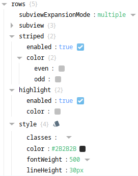
Striped color on tables doesn’t carry over when I updated - its returned to a blank color despite having been used before the udpate.
On popups the top bar is now transparent. The behavior may be different based on if the close icon is supposed to be displayed or not or if using the popup action vs. scripting to trigger the popup. We typically use system.perspective.openPopup(‘name’,‘view’,modal=True,overlayDismiss=True).
Old:
new:
Table font sizes and headers have new default looks. Font size has changed, headers have no default color and need it set up. That part I can see being intentional, but the font size changing in the table was surprising.
Hi Kyle, could you provide a project export or anything like that? Also any specs on your environment would be helpful. What OS? What build? It’s hard to tell what’s going on exactly in each of these situations without the full project context… That said, here’s what I have for now until we can get some more info!
Unable to replicate with the details provided. Are there any other containers involved in this layout? Embedded views? Nested containers? How tall is the coordinate container? 0.02 Y position is quite small and maybe only perceptually looking like “the top” if it’s a small size to begin with.
Unable to replicate with the details provided. Again, what’s the container context of this component? If you set the slider value to 50, can you see the handle then? At 0, the handle is positioned so far left that only half of it may be showing when selected.
Very odd, I’m not sure what’s going on here. Does this appear the same on existing and newly created toggle switch components since the upgrade?
I think you may have included the wrong screenshot here?
The new default striped-odd row background color is very subtle. is it possible that it’s simply not visible on your monitor?
Unable to replicate. Project export would be helpful to diagnose.
The font itself changed, not the actual size. That said, the new default font is a bit wider, so it seems larger in some contexts, like data-dense tables unfortunately.
Hi
I want to add some custom style in light.case file.
What I wonder why I should create my style with prefix of psc- ?
For example my style name is Wave-animation but if I want to access it in perspective I should use
.psc-Wave-animation in light.css.
I will have to follow up on some of these when I have a chance to go back to 8.0.14+. At this time I had to revert back to 8.0.10 because of numerous issues we didn’t have time to address. In the meantime here are some comments.
It’s just a NumericEntryField inside an XY container set to percent mode. You can see the blue outline is where it is supposed to be, but the numeric entry graphic (white box) is not inside the blue box despite it being that object.
It has nothing to do wit the position of the handles. There are actually two sliders there and the other is at a non-zero/non-max value and still not showing up. It works just fine on 8.0.10 on these settings.
If I drag a new toggle switch in from the Perspective Components menu it looks like this as well.
Wrong picture, but my text should sum up whats happening. This isn’t specific to 8.0.14 - I see this in 8.0.10 as well. I just recreated it in 8.0.10:
This is what I input - clicked “All Corners” then typed 5 in top left (it made them all 5):
Then hit OK and this was the result:
Even if the default is very subtle - why did it change the values I already had entered? It changed values I had - it shouldn’t do that. I’d have to look again if it was truly so subtle my monitor was an issue, but I have two different monitors (laptop and desktop) and they are different and I couldn’t see it on either I don’t believe.
I’ll follow up with some backups in a private message.
I’d have to upgrade versions again to check.
Would manual changes to the theme files possibly cause any of these? I don’t know if we made any, but I’ve noticed I need to revert to a back up theme file after downgrading back to 8.0.10 or the text styles and some other things look incorrect (seem to default to Times New Roman maybe). Rebooting the gateway appears to restore the Times New Roman and make me re-copy over the back up theme files.
Hi
I need to use some ccs code that doesn’t work inside the components style. For example position relative and margin auto doesn’t work in xy container but adding ! important keyword in css class works perfect.
Or for hover effect I need to manipulate other css property that doesn’t exist in style gui interface yet.
By adding .psc-myclass in light.css I manage to create very interesting effect.
Also the animation in style class is very limit right now and I ask IA to add a menu to add custom case code in designer for a while.
For example if I want to animate filter property there is no option unless I write my @keyframe code in light.css.
Okay, well the reason you need to use the “.psc-” prefix is to avoid potential collision between Perspective Style Class names and classes that we supply by default.
For example:
I’m using a Button component and I want to create a Style that I think describes how this primary Button should look. I name this Style “ia_button–primary”.
In this case, if we hadn’t attached the “psc-” prefix to the style class, all primary Buttons would use your Style - instead of only the ones you apply that Style Class to, because the theme-specified “ia_button–primary” class would have its values overridden by your Style Class of the same name.
Ray - I was able to update a gateway to 8.0.14 again and checked a few things.
'3. Toggle switches come in with no colors defined and are essentially invisible. It happens for new ones I drag on and breaks old ones that didn’t have colors specified before.
'5. The table appears to have NO color difference between rows. The header is also transparent now by default it seems. Intentional? Or is something wrong on my end?
'7. In tables the default size definitely is different for me. In tables where the font size was set in the rows section nothing looks any different, but when it wasn’t specified the font size is definitely bigger. The row height seems screwed up as well. Both of these have the same properties set for rows (you can see here again where it wiped out colors I had specified already which is very frustrating).
Old:
New:
Again, I’m not sure if maybe something is screwed up in our themes. Could you provide a clean set of files for the themes folder that I could try putting on our gateway to see if that affects things?
The files themselves might be correct, but your browser (or Designer) might be using cached resources. Please try clearing your browser cache to see if that solve the problem in a session. If so, you should also clear the Designer cache. You could also use the browser’s developer tools to inspect elements in a session to see what resources they are using.
In the following screenshot, you can see that 8.0.14 Toggle Switches should expect to have their color set by the light.css resource, and that color should be defined by a variable named “–label”. That variable is itself set by another variable: '"–neutral-90". The “–neutral-90” variable is defined as #323232. Again, if you don’t see these properties in place, but the theme files are in the expected directory, you should clear your browser cache.
OK, so let me make sure I am doing this right, because I’m sure I’m missing something somewhere. First, I just want to make sure you know I have the gateway running on a PC, I’m using Designer in a VM session, and I can view the client on my host PC as well as in the VM. I also have a Surface Pro laptop that I am using as a client with Chrome.
After clearing all of these I notice NO changes at all in how things are presented. All the issues I’m seeing are present on every single client and designer.
It doesn’t seem to be referencing the light.css like it should though so I feel like I’m not doing something right. Is a reboot necessary after clearing .ignition?
Here are two different toggles - one had colors defined, the other is strictly default (and is invisible now). Both appear to have the boxy look instead of rounded as well.
Clearing the Ignition Cache would fix the Designer, but would have no effect on any sessions. Since you are not seeing the issues resolved on the Designer, it leads me to believe that the files are not in place as expected. I would recommend you contact support for further assistance.
Some of the issues like Toggle switches and tables and the top bar on popups have been fixed by deleting the whole themes folder and letting it rebuild itself, so that is good. There was definitely an issue with the theme files.
Hi
I try to create scroll touch effect with following code in my theme:
.psc-mySlider{
-webkit-overflow-scrolling: touch !important;
scroll-snap-type: x mandatory !important;
scroll-behavior: smooth !important;
}
But it doesn’t effect in perspective scrollbar. Do you know what I did wrong?
is there a way to set the background color inside a tab container to transparent using theming. It appears to use the following by default. I tried to change background color in the ia_tabContainerComponent__content and that didn’t work. Not a CSS expert so I’m not sure if there needs to be something nested, but I tried a couple things and couldn’t get it to work. I’m sure I could just override container–secondary, but I’m not sure what else that will affect.


