Ok guys.
I’m going to ask if this is even possible/has anyone done it before going down the rabbit hole of trying…
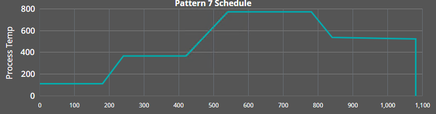
I’m controlling the ramp/soak times of an oven. I’ve created a screen where I can punch in the temp and time, and get the plot of it.
Works amazingly.
So lets complicate it.
Is there A way i can then plot realtime data over this chart? To kind of in realtime see the data come in and how it lines up with the schedule I have pre-plotted?
Schedules are anywhere from 6 to 14 hours and I only want to trend temperature reference as well as feedback. I did get powerchart as well as Line Timebased charting to work today.
Any suggestions?
Thanks guys
I’d be trying to perform a transform on the data returned from the historian. I did something similar to subtract the initial count from the Y-value so that my XY chart always starts from (0, 0) no matter what time interval is selected. Here’s my script transform modified (and untested) to subtract the start time from the actual time returned from the historian. It might give you enough of an idea to get you going.
output_json = []

initTime = value.getValueAt(0, "t_stamp") 	# Start time

for row in range(value.getRowCount()):
	row_object = {}
	row_object['xvalue'] = value.getValueAt(row, "t_stamp") - initTime # You need to convert to s or minutes to match your X-axis units.
	row_object['temperature'] = value.getValueAt(row, "temperatureActual")
	output_json.append(row_object)
return output_json
Transistor,
Pardon my ignorance, but can you give me a hint on where i would paste this code in to start tinkering?
i’m new to Web based HMI design, but, a veteran of older platforms.
Thanks!
The procedure would be the same if you were doing this in Vision or Perspective although the chart setup is a quite different.
- You’re going to have to create two data sources under the XY Chart PROPS.dataSources. The default one is ‘example’. You can reuse that if you want and the other might be ‘rampSoak’.
- Create a tag history binding on ‘example’ and retrieve the records from the historian for the period of interest. We’ll look at manipulating this later.
- You now need to get your rampSoak data into a format that the XY Chart can use. It seems that you have already succeeded in this.
Now you need to make a decision. Are you going to convert your historical datapoints into seconds since the start of the chart or are you going to convert your rampSoak data into timestamps starting at the same time as your chart?
Since the example data is now coming from the historian it may be easier to manipulate that.
- Open the example binding and add a transform script.
- Set the Value Format dropdown to DOCUMENT. This will feed the data into the transform in JSON format which is easy to manipulate.
- Paste in my code and start working with it. Note that value is the JSON object passed into the script.
If you get it working you’ll be able to inspect the results by expanding the two data sources and inspecting their values. After that you’ll need to get the data sources to display on two different pens.
Have fun!