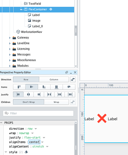
I have the red X from the image manager and two labels in the same flex container row
For some reason the X is higher than the labels.
What are some ways to adjust the height in there?
I am going to generate many rows.
Is it also possible to tint the background of a flex container row?
Edit, got the row to color, still have alignment vertically issues
There are a couple of things to consider here:
- You can modify the value for the
fit.mode property of the image you have placed, but this could affect the size of the “icon”/image you’re using and distort or blur the edges. In the following screenshot I’ve set fit.mode to a value of “contain”. You can see the image is now centered, but it’s also a bit larger and sort of blurry.

- I recommend aligning all of the items in the Flex Container to align on center by modifying a property of the flex container. Set
FlexContainer.props.alignItems to have a value of “center”. This should avoid distorting the image and will render all components in the row with their midpoints aligned (more or less).
Thanks
That looks good in the second option. I think I did that, except I had the text set to size 24.
Does it look aligned for you still if you have the text size 24 for the labels?
I was opening the page in Edge. It was more noticeable on my 1080x1240 monitor in Edge than on the designer.
I have a separate issue that I didn’t research yet.
I have set a flex row container that is nested 3 flex containers deep to have a background that appears light blue. However, because it shows up as dark on the webpage, I am going to make and use an image that is a colored square and set to fill. I am not sure if there is a better solution, but I thought maybe I should mention it to learn more about it.
Edit: I got the color thing sorted
I found out the triangle has the light/dark configuration
The transparency was generating 2 more digits in the RGB code and when I had that, then the color of the background came out very dark in Edge

