I have a basic project and all of my flex containers that are "screen wide" are scaling as they should.
I have three flex containers (column) embedded in a screen-width flex container at the bottom of the screen. Basically, this is to have a three-column display of information at the bottom of the screen.
The three embedded column flex containers as well as the screen-wide flex container are all set to grow and shrink at the "1" scale factor. However, the contents of the three columns at the bottom do not shrink when viewed on a small screen. On a large screen, the data grows accordingly. I do have the basis of each set to 200px because that is the minimum pixels required to display the information.
Has anyone had experience with multiple columns in perspective? I'm undoubtably doing something wrong, but I can't find any examples that are similar to help me troubleshoot my project.
Thanks in advance, Joseph
Maybe the content of your containers is blocking the shrinking ?
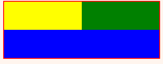
Here's a flex-row container (red border) containing 3 flex-column containers:
Is this what you have ?
the flex-row is set up with grow: 0 and shrink: 0,
the 3 flex-column are set up with grow: 1 and shrink: 1 and a 200px basis, which doesn't actually do anything since they can shrink and grow.
It scales like you'd expect:

note:
I'd probably keep shrink: 0 on the inner containers, set a sane basis, then set the outer one to wrap.
So you keep things large enough to display your data, and it doesn't get ugly when the viewport gets small:

Yes, that's exactly what I have. My content is just a label in each column with some tag data.
I'll attach some photos of the project on two screens of very different sizes. I wouldn't think a label should prevent scaling. At least that was why I went with a label (internal object to perspective) instead of a graphic (external imported object).
I'm seriously perplexed.
Oh, I've tried shrink set to 0, set to 1, 2, and 4 in multiple combinations with the same values (matched pairs) and mixed values (unmatched pairs) from the same set (0, 1, 2, 4,) for grow. All combinations of shrink and grow yielded the same failure to scale to a small screen.
The odd part is if the row goes all the way across the project screen, it will scale to any size screen perfectly.
Well it seems like the containers did shrink. Their content didn't. Set shrink: 1 on the labels too, or maybe change the font size to something dynamic instead of px or pt. I can't tell you exactly which one to use, but try something like rem or vw or some other relative units.
That said, if your application was made for big monitoring screens, you could also design the view differently, in a way that's more suited for mobile devices, using a breakpoint container for example.
Thank you so much, I'll try a different datatype on my text. I was oblivious to Ignition being able to handle something like that. I'm brand new to ignition and this is my first project. I raelly appreciate your guidance.
I thought I had kept the font size down enough that it would translate to the small screen, but obviously I was wrong and completely blew that one.


