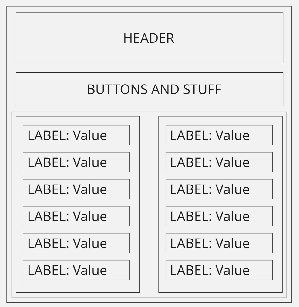
I am looking to get some guidelines from you folks as I am questioning my layout. I am trying to layout a screen that provides details on what seems to me is becoming flex container soup. Please see the image below and I will break down what I am trying to do.
- every rectangle is going to be a flex container, the header and buttons one are easy
- There are two sides that need to be displayed next to each other
- One main container will hold the left and right flex container
- left and right flex containers will contain a bunch of flex containers with label/value pairs
- I planned on using a flex repeater for these.
Is this the wrong approach for what I am trying to do? It seems like a lot of containers, I was wondering if you had any suggestions or just keep going with my original plan? Thanks!
Your layout isn’t incorrect by any means. I normally take a different approach with major sections of a page, where you create the “Buttons and stuff”, the title, and the label value panels as an individual view of their own in a subfolder next to the root view (I call mine “/components”). Then you can modify just this section without browsing through nested containers. Then you just drag the view onto the root view and arrange the sections as you see fit. This also forms the basis of the responsive, or mobile view, because now your page is split logically and can be physically rearranged as screen sizes change.
For the label:value sets, I have built a standard component that is used project wide, that has tag drag and drop on it and has parameters for the label set up on it. I normally just manually drag the tags in I need for this, but this would be suitable for a flex repeater if your tags were fast to build lists out of.