We are working towards switching from Vision to Perspective. One thing we would like to solve for is how to have conveyor layouts auto adjust to screen size on different size desktop monitors (not related to mobile design).
Below is how it looks on a laptop and a bigger monitor. In case of the bigger monitor I want it to grow and keep all the same ratios, just be bigger. It leaves too much of the screen empty and because the components themself don’t grow, it kind of defeats having a bigger screen anyway.
It seems necessary to have the conveyors built on a coordinate container with fixed settings so that they are relative to each other but then putting that in a flex container does not get us what we want.
The behavior we want is like an X/Y chart inside of a flex container.
Weird…do you have style classes set on those components? Wondering if there is some weird interaction happening there when the aspectRatio is set. I’m just grasping at straws though…
Ran a quick test and this is how it stretches for me if I don’t set the aspect ratio:
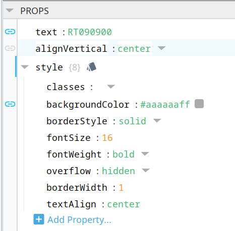
A “conveyor” is just a flex container and a label. The label background color is based on the value of a motor UDT state. The label text comes from the parameters of the associated motor UDT. The conveyor can be clicked on to get a detailed status bit pop-up window.
Hmm…I can’t seem to replicate the weird sizing you’re seeing when the aspectRatio is set, even with embedded flex containers. What do you have set for the props on your flex containers? And do you have the label components set to grow?
You could use calc() in a fixed container, that requires some math tho, and be careful as adjusting the container (by accident) by dragging it while it has a calc() value it gets overwriten (so maybe add it in an expressing binding) i use this often to float something to the side of a screen.
you can also use it on x,y,width and height
The desinger marks it as wrong but it works
There was interest expressed in this topic recently so I wanted to come back and add a bit more to this thread in case it can help someone out there. Will speak below about the direction we eventually went with conveyance layouts in Perspective.
The starting point is to have UDT's configured for the conveyor which presents the associated status bits in a predictable way. We have 1000's of conveyors so the UDT's are instantiated via scripting based on the vendor provided tag sheet (most data we work with is MODBUS). If anyone is interested in more details about how to instantiate UDT instances with scripting, let me know and we can start a separate thread.
The actual layout is then done in a coordinate container to allow the conveyors to be placed in physical relevance to each other. To make it flex the ratio option is selected on the coordinate container root and the aspect ratio controlled as follows:
That's probably your issue. As the container scales with the view the flex container will adapt. Sometimes, it doesn't work exactly as one would expect. I like to used scaled coordinate containers for my templates (embedded views).
Also, setting the ratio to 1:1 won't fix the issue. You need to set it to the aspect ratio of the view that you designed the layout on. Looks like maybe it's 1920x1080, so 16:9 in that case. Then, the view will always be 16:9 and will be contained by the device's resolution, filling the extra space in the other direction with whitespace.
Has anyone else attempted this approach? It is listed as solved, but following the steps listed twice I still have scaling issues. When I attempt to embed the coordinate container into the flex container it appears smaller than I designed it and all the labels have scroll bars; the elbows do not. When making it fit to the flex container separation begins between the components. I first attempted a different approach just using components from the symbol factory. Those conveyor systems were great on the desktop, but fell apart on smaller/ larger screens. Ideally we would like to have this on a tablet for technicians to use in the field, is that even going to be a possibility?