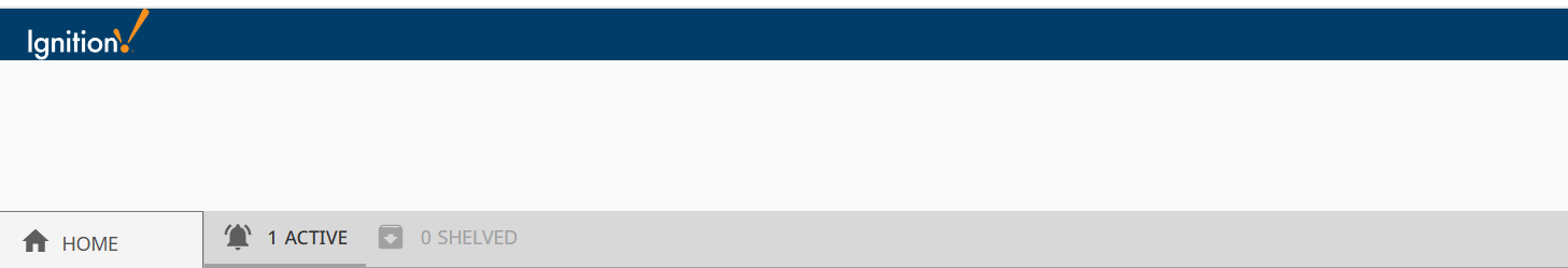
Hello, I have been able to reduce the height of the blue bar at the top my web server screen, but for the life of me cannot figure out how to reduce the whitespace below it. I am using the ProveIt demo from the exchange as my base perspective project. Any guidance on how to reduce the white space? I would like the content, for example the “home column” show below to jut right up next to the blue tab.
The blue bar at the top is the Header, and I can manipulate that. The Home menu is in the Docks and I can manipulate that, but the white space must be on some sort of home screen or something that is common to all Views, and the views just lay on top of this, or something. I can’t find it to reduce the white space so that my views go all the way to the top near the blue header.
Can you describe (maybe draw some boxes on your screenshot) what is in a dock ?

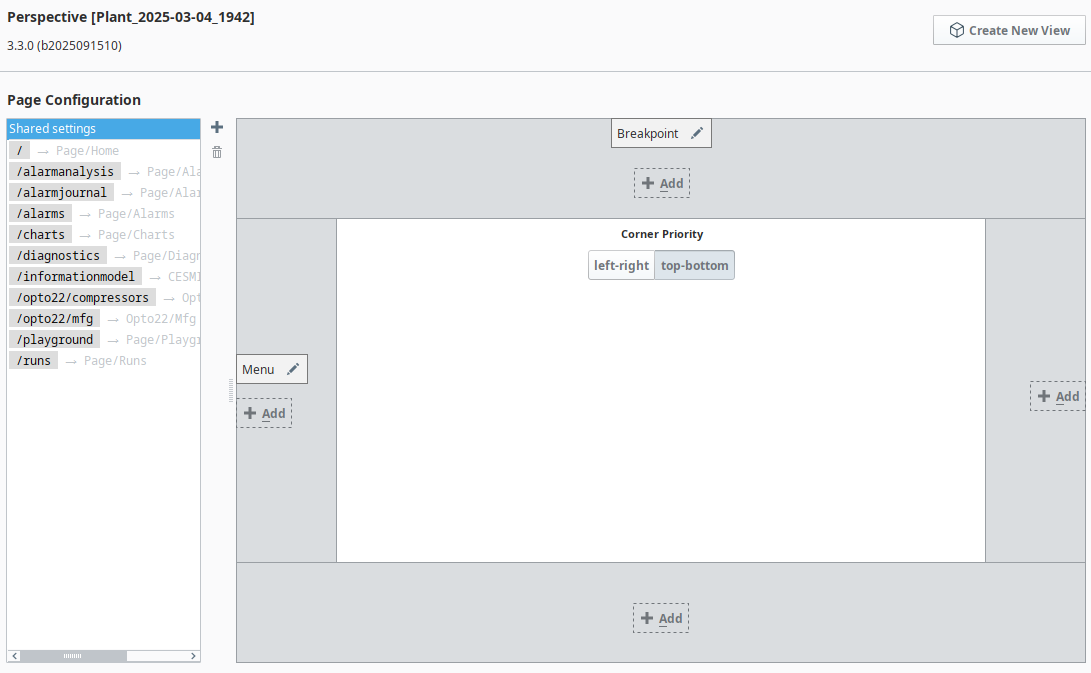
In the browser, right click on that area and click 'inspect element'. It should show you how it is computing that space, whether it is margin or padding. Then, you can use those clues to look at your Views like the Breakpoint one (navigation bar from the looks of it), or the current view you are showing below it. One of those might have some styling that is giving you the trouble.

On this screen, press the pencil icon on the top configured dock, see what the 'size' property says.
Yes! There it is Ryan. Hiding in plain site, I am not surprised! Again, thanks!