I need some help setting up a Time Series Chart using perspective. I read through the forums and help files, but am still missing something.
I understand that the time needs to be in the first column and ascending order. I did confirm that it is in datetime column in MSSQL.
The only message is a component error on the chart. Any help would be appreciated. Thank you.
You should be able to hover or click on the component error for more information. At first glance your dataset seems to be ok. Maybe post your 'plots' information, namely 'trends' and 'axes'. You need to have these set up properly too.
Thank you for your reply. This might be where I am confused. I understand it as follows: bringing in the dataset from the query will automatically bring in each column of data and plot the data. Do I need to create a series for each column? If true, do I need to link the data back to the query, or can the data be linked to the first data series?
Nope. You should keep it how you have it, otherwise each column will get the same pen color. By keeping everything in 1 series like you have it, the chart will assign a unique pen color to each column.
Your data appears to be fine. I'm wondering if you still need to set up the trends and axes for the chart. Below is a working example from an OEE time series chart that I have made. I don't have it broken down into performance/availability/quality but the idea will be similar for your chart. I have 5 different trends because there are 5 different sets of data that I might be plotting on this chart (including OEE).
Well, I think I have set it upright. I changed the name from time to OEE, thinking maybe time was some type of a reserved word. But still no luck.
Do you see anything that is not correct? Again, thank you for taking the time to help.
That all looks ok to me too. So you are getting a component error? Are you able to investigate the error message at all, or check the logs or anything? Here's an example -

Well, it now started to work. I went out and came back in the software, and it was there. I must had an original error that blocked the fixes because it is working.
I appreciate your help. Looking back on it, I might have had issues with the trends and axes properties. I didn't know you had to have the those setup as well.
Awesome, glad it is working now. Now you can keep going with cool visualizations, color schemes, etc. It took me a while to wrap my head around the time series chart component myself -- lots of configuration needs to go into it in the beginning, but the end result is quite nice. I'm overlaying other events like in the below example, which has helped our operations team out a bit.

I like the downtime overlay; that is a great idea!
Cool! What did you do to plot the Downtime that way, looks clean!
Here is a link that shows you how it is done.
Downtime Chart Overlay
In case you can't see the link that @Steven_Ham1 posted, I am copying and pasting here:
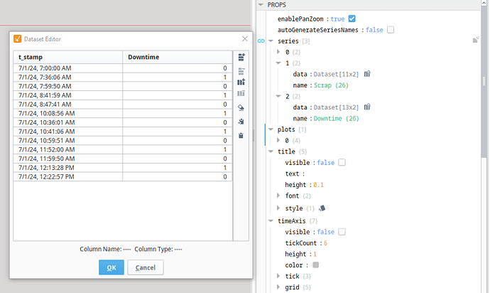
Of course -- first step is to get your downtime data pulled in and formatted like so:
When a section of downtime begins, the value at that timestamp should be 1. When that same section of downtime ends, the value at that timestamp should be 0. This creates a basic step function. I can show you the named query I used to get my data like this, but your data might be completely different than mine. Just let me know if you run into issues there.
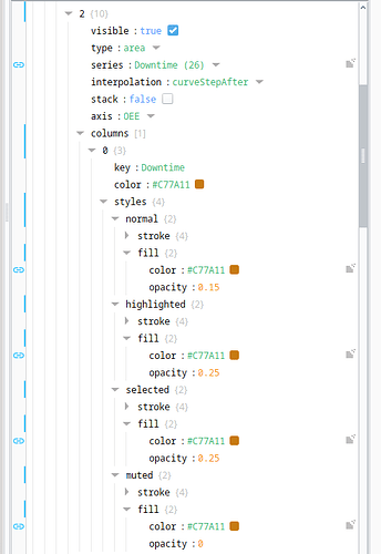
Next, you just need to set up an additional trend on that time series chart with a configuration like this:
The key values to note here are type: area and interpolation: curveStepAfter. Those settings combined with the low opacity column color selections together create the semi-transparent overlay effect.


