Hello everyone,
I'm hoping to get some assistance with a chart modification I'm working on.
I’d like to color-code each bar in my timeseries chart based on specific logic. However, I haven’t been able to find a built-in feature or workaround that supports this functionality.
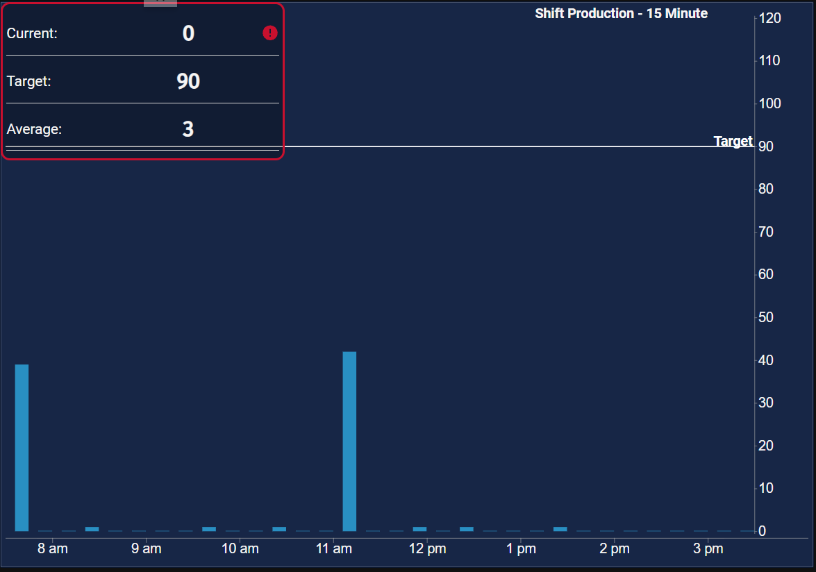
Here’s what my current timeseries chart looks like:
My initial thought was to switch to an XY Chart and use the deriveFieldsFromData option to achieve the desired bar coloring:
Unfortunately, switching to the XY chart results in the loss of the target baseline feature, which is important for my use case.
Does anyone have suggestions for either:
1: Applying conditional coloring to individual bars in a timeseries chart, or
2: Implementing a baseline with custom labeling across the screen in an XY chart?
The image below would be my expected output:
Any insight would be greatly appreciated!
Bumping post to get suggestions.
You can do a transform on the dataset and insert the colors you want.
The below example I am just returning a random color from a function, since we just want different colors on each bar. But you could easily assign colors by value, or label, etc.
def transform(self, value, quality, timestamp):
    nds = []
    pds = system.dataset.toPyDataSet(value)
    for row in pds:
        nds.append({"x":row[1],"y":row[0]})
    self.props.data.datasets[0].data = [row[0] for row in pds]
    self.props.data.labels = [row[1] for row in pds]
    self.props.data.datasets[0].backgroundColor = [project.Useful.randColorHex() for row in pds]
While it's not quite what you want, here's the XY Chart heatmap.
You can add the target line with a line plot. You just need to supply it with two points, (tmin, y) and (tmax, y).
Does this method work for the timeseries chart?
I tried changing the data from a dataset to the following structure:
I tried backgroundColor, color, Style –> backgroundColor
I also removed any other color related values to a default of ‘‘ to ensure those would not overwrite my manually input colors and I am still seeing the regular color appear.
You would need to set the colors under the default styles for the standard time series chart.
self.props.defaultStyles.colors
Thank you for the help I used this method to parse out my data to Above/Below target then colored those columns specifically.