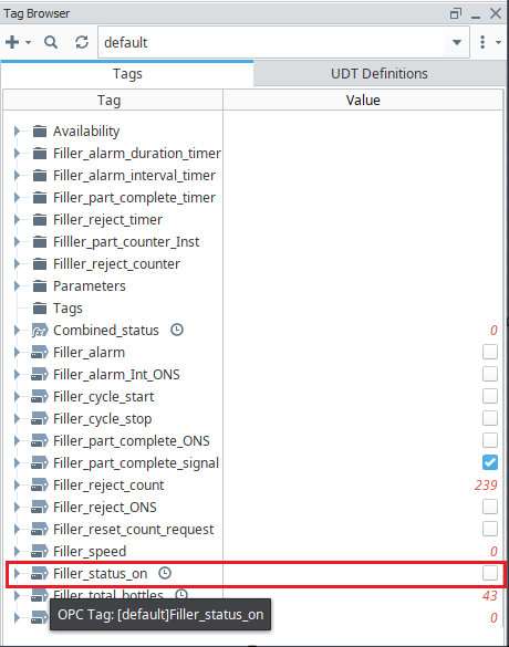
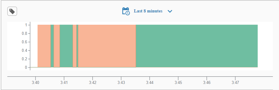
Hello everyone, I want to create this chart in Ignition Perspective showing Green is Runtime and Red is downtime. I am using one OPC tag (Filler_status_on) to toggle. Can someone help me with this? thank you very much!

I've never attempted this before and there may be a much better way to do it.
What worked for me was to create an additional expression tag that is just ! {[~]Filler_status_on} and historize it also.
I then added both of the tags to a power chart and set their pens Display type to area, and the interpolation to curveStepAfter.
I just left the colors default but you can adjust it to whatever you want.
I'd recommend using this ribbon chart from the Exchange as a starting point.
Thank you so much. Is that possible if you could share the screenshot how you set up the PROPS of the power chart?

thank you so much