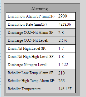
Here’s a little table I setup with labels on a XY coordiante view set to percent, this is how it looks in the Designer:
Here’s how the table actually looks on the live web browser:
I don’t see how evenly spaced components become so distorted.
Here’s a little table I setup with labels on a XY coordiante view set to percent, this is how it looks in the Designer:
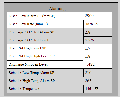
Here’s how the table actually looks on the live web browser:
I don’t see how evenly spaced components become so distorted.
You really shouldn’t be using a coordinate container to try to lay out things like this.
Make a flex-container based view that’ll be the ‘Row’; add two labels, set the left one to grow: 3, and the right one to grow: 1. Give it two parameters (label, value) and bind the label’s value to those parameters. Give it a third parameter for background color, if desired.
Then add a flex repeater to your screen. Add as many instances as you have. Add label and value keys to the instances to set up your individual instances.
In basically no circumstances should you be manually aligning things pixel by pixel in Perspective.
