Is there a way to remove the margins from the Time Series chart like you can from the XY Chart?
Or can I format the XY Chart to look like the Time Series? The XY just keeps my dates as ms rather than convert them to a date like the Time Series does
XY X-Axis settings

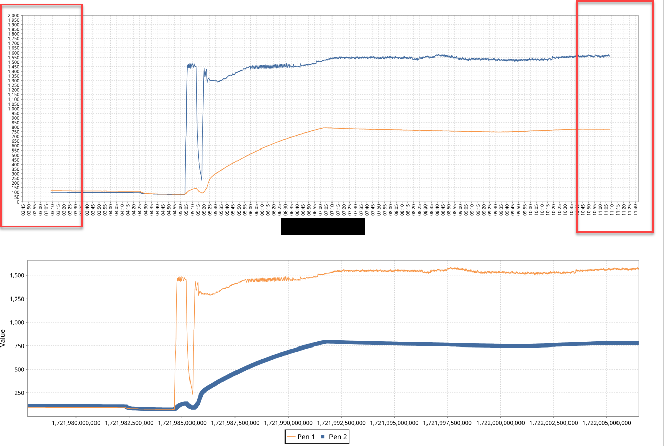
The top chart is the Time Series, the Bottom is the XY Chart. I don't want the margins on the left and right.