Responsive square not being fully constrained by parent container

I’m trying to create a responsive square that will automatically resize to fit the size of its container.

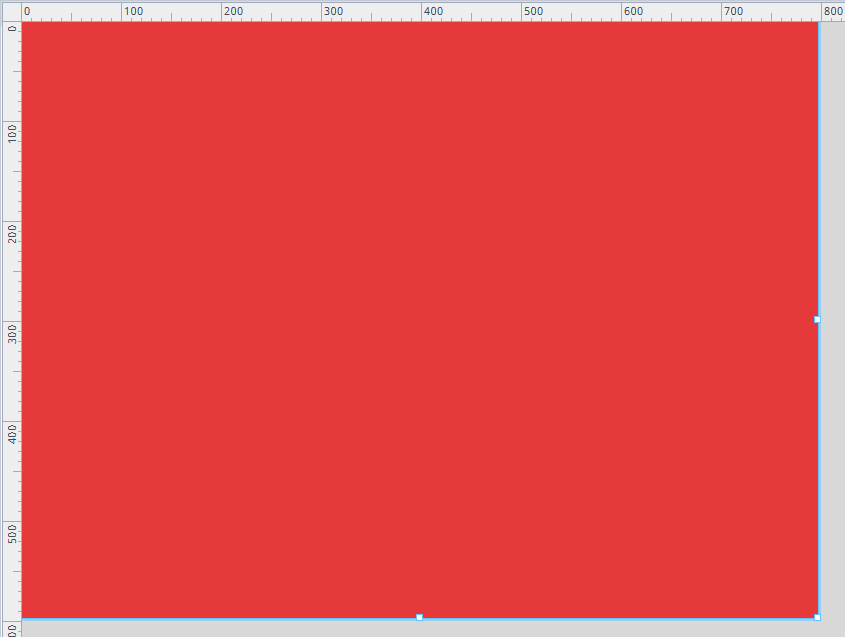
I’ve tried using aspectRatio: 1/1, but whenever I set any width/height/maxWidth/maxHeight styles it seems to either overwrite the aspect ratio or fail to constrain in one direction. Either it constrains vertically and overflows on the horizontal when the parent’s width becomes less than its height, or vice-versa for the horizontal.

Is there a set of properties that will make this work as intended? And if not, is there a workaround?

aspectRatio: 1:1
Im not sure the slash works in this prop.

I’ve been using 1/1 or 1 throughout the project and it’s been working fine. I’ve just tried 1:1 and it doesn’t appear to work.

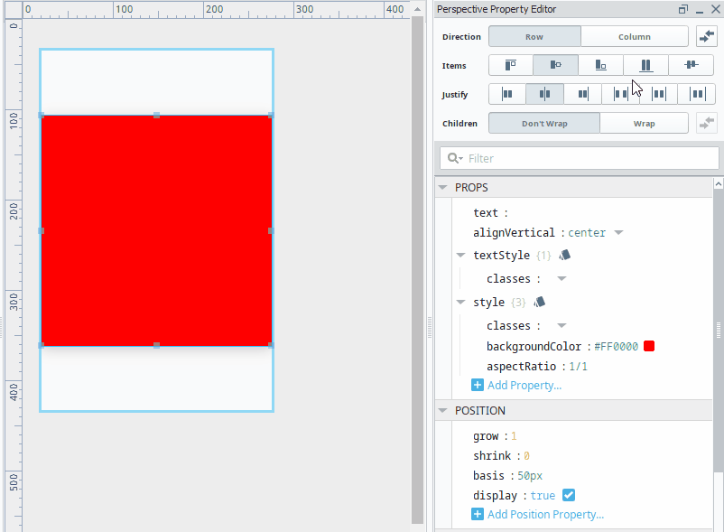
Ah, context is important, in the Coordinate Container, aspectRatio is expressed as 1:1. You did not mention that you were on a flex container using custom styles for that.

Ah apologies. Yes I have been using a FlexContainer. Is there a solution that works better in a CoordinateContainer?

My issue is that it only every constrains on one axis:

I’ve tried using maxWidth and/or maxHeight but it never seems to be able to work for both axis.

You have the alignItems set to center, you need to set it to strech. You actually don't need the aspectRatio style. Setting it to strech will make it fill the entire height, the grow setting of 1 will make it so that it always fills the width. I've used the aspectRatio here just to duplicate your example.

animation

That’s not quite what I was aiming for. I wanted the red square to maintain its square shape (all sides the same length), and just resize so it fully fits within its parent container without overflowing.

Example:

Make a truly responsive square with CSS | by Kristoffer Højelse | Medium

Then set the Grow and Shrink to 0, and Overflow to hidden. Then the size will be set by the basis.

1 Like

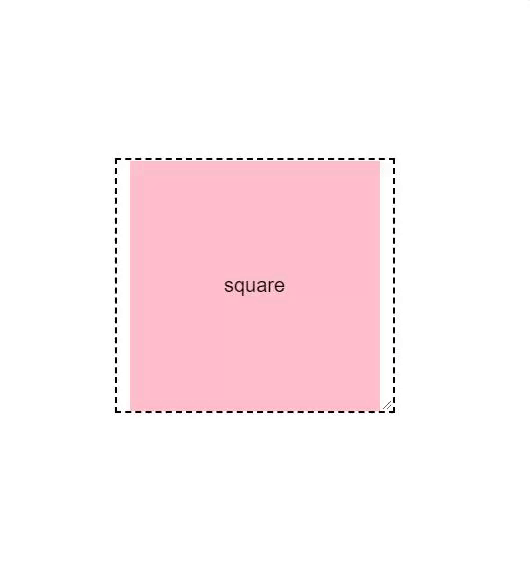
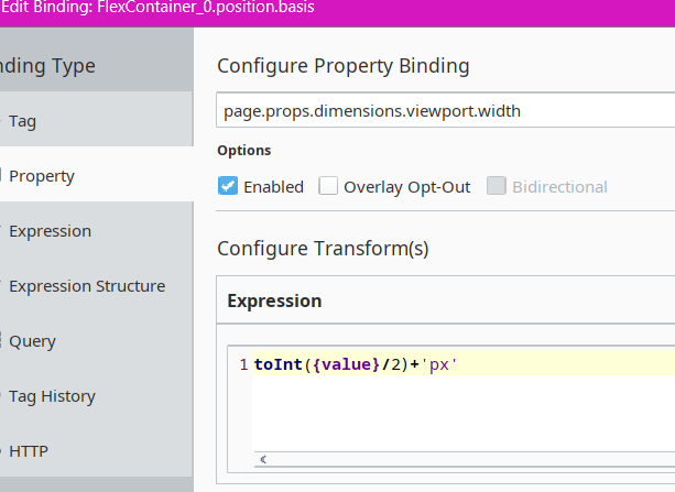
Better version. The 1st wasn’t really responsive in the browser. It just maintained size. This one actually adjusts. It’s setup to be 50% of the width of the viewport.

Structure:

On the Flex Container, bind it’s position.basis like so, with a grow/shrink of 0/0.

You can also use this expression instead, so it responds to both height and width of the window:

toInt(min({page.props.dimensions.viewport.width},{page.props.dimensions.viewport.height})/2)+'px'

On the Label (the square) - set it also to a grow/shrink of 0/0, with it’s position.basis still bound to the position.basis of the flex container.

1 Like

Sorry for the late response,

That works perfectly, I’d thought of doing it that way using css but I must’ve mis-typed it previously or had the arrangement incorrect.

calc(min(100vw, 100vh)/1.5)

For anyone else who stumbles across this, this will be much more responsive than an expression binding.

1 Like