Better version. The 1st wasn’t really responsive in the browser. It just maintained size. This one actually adjusts. It’s setup to be 50% of the width of the viewport.
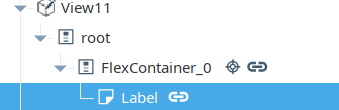
Structure:
On the Flex Container, bind it’s position.basis like so, with a grow/shrink of 0/0.
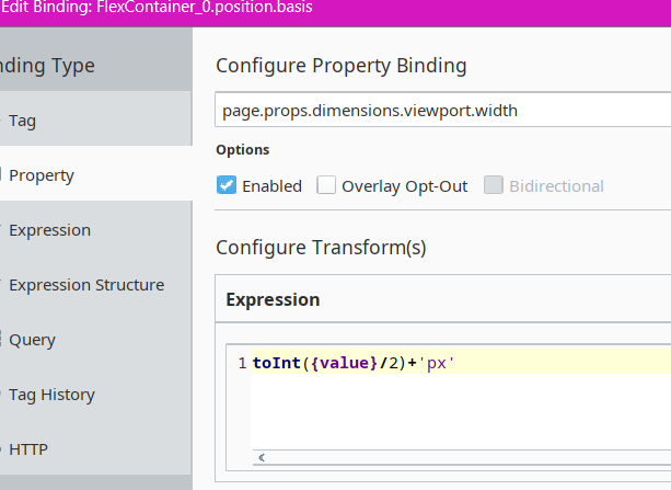
You can also use this expression instead, so it responds to both height and width of the window:
toInt(min({page.props.dimensions.viewport.width},{page.props.dimensions.viewport.height})/2)+'px'
On the Label (the square) - set it also to a grow/shrink of 0/0, with it’s position.basis still bound to the position.basis of the flex container.