Hello,
I have created a timeseries chart in the report module. In this chart a value is logged in the database at a specific time.
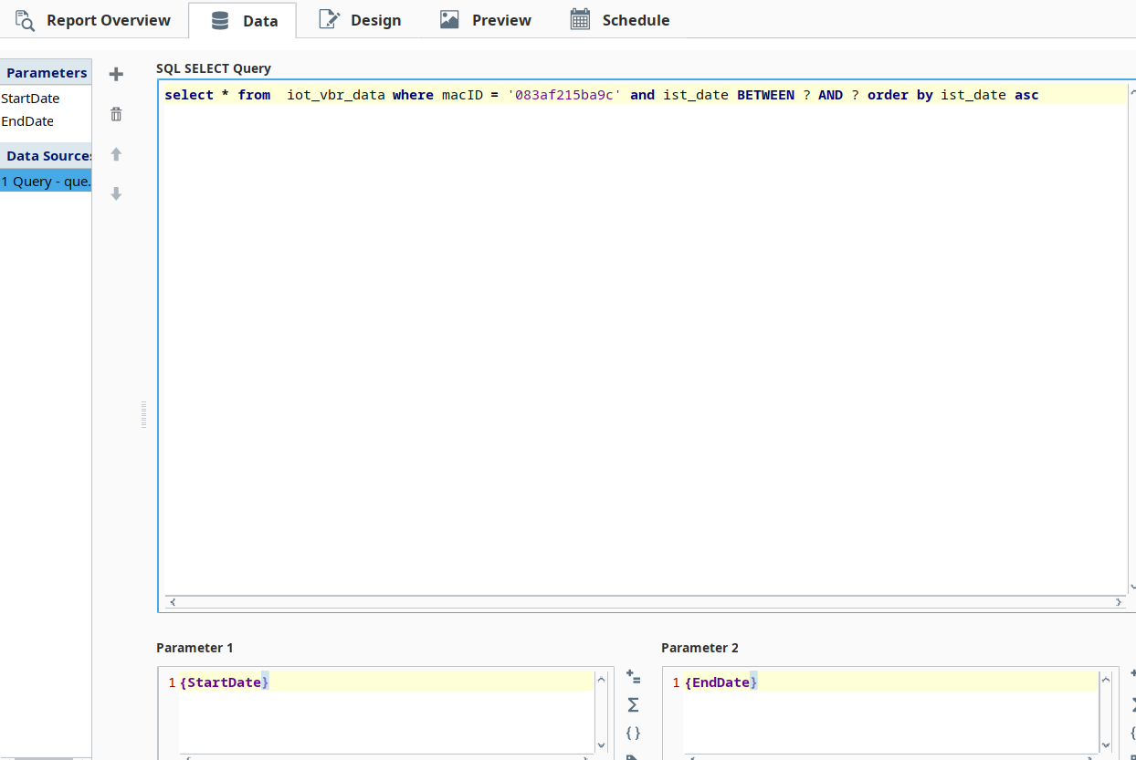
SQL query.
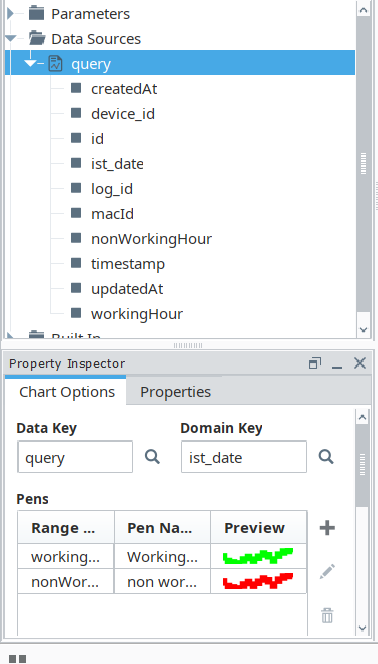
Timeseries chart configuration.


Report.
Problem :-In this Report, you can view the gap between working and non-working hour trends. there should be no line gap between working and non-working hour trends. The working hour line and non-working hour line should be connected. It should be a straight line.
Specific time
- Working Hour :- 10:00 AM to 07:00 PM
- Non - working Hour :- 12:00 AM TO 10:00 AM ~ 07:00 PM TO 12:00 AM
Sensor data is logged in a database and the database is linked to the ignition. (NOTE:- NO DEVICE DRIVER THROUGH CONNECTION TO IGNITION. ONLY THE DATABASE CONNECTED TO THE IGNITION.) Log sensor data to the database at every hour interval.
Table structure
This isn't an issue with the chart. Working hours and non working hours are two separate pens, there is no reason why the chart would join lines between their data points.
If you want the non working trend line to extend out to 10am and 7pm to give the appearance of a continuous line, you'll need to ensure extra data points are logged for those times. That logic needs to be put in place in whatever system is logging the sensor data into the database.
If both time range values are stored in one column (non-working hours and working hours values). So, I run a query in the reporting module and get the data from one column.
So, is there any function or script in the time series chart to automatically change the colour (green to red) according to working and non-working hours using just one pens? (data key)
I don't believe there is a way to have a single pen displayed in multiple colours.
Your best bet is to add extra data points at the overlap of working/non working hours to make the line appear continuous. You could do this with a script datasource after your query datasource.