Hi everyone,
I'm new to Ignition and currently working on a project involving a hydrotester. I have a dataset tag that stores time-series data: the X-axis represents the timestamp when the start button is pressed, and the Y-axis records the testing pressure.
I’m using two Timeseries Charts:
-
One in my Perspective Template Overview
-
One in the Reporting Module
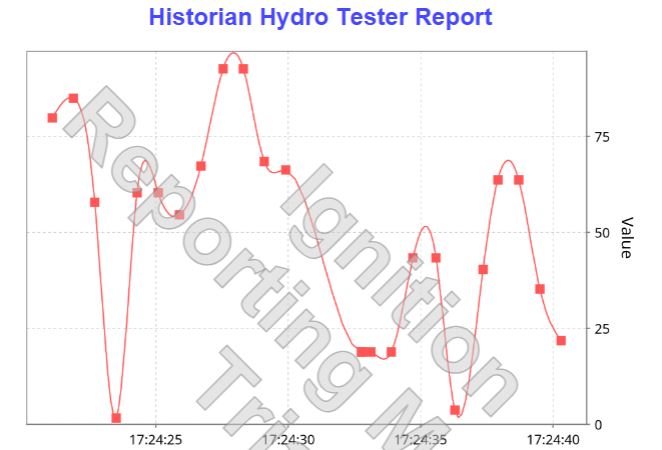
Both are bound to the same dataset tag. The chart in the Perspective Overview displays a smooth curve, which is ideal. However, the chart in the Reporting Module shows a step/ramp function, which doesn’t reflect the actual pressure behavior accurately.
Here’s a summary of my setup:
-
The dataset tag is updated via a Gateway Timer Script.
-
The script appends new data points (timestamp and pressure) to the dataset.
-
I keep only the last 100 points to manage performance.
Here’s the relevant part of my Gateway Timer Script:
“def handleTimerEvent():
# Tag paths
start_tag = "[TPDVHYDRO]DV-HydroTester/Start"
stop_tag = "[TPDVHYDRO]DV-HydroTester/Stop"
reset_tag = "[TPDVHYDRO]DV-HydroTester/Reset"
dataset_tag = "[TPDVHYDRO]DV-HydroTester/Dataset"
y_axis_tag = "[TPDVHYDRO]DV-HydroTester/YAxis"
reference_tag = "[TPDVHYDRO]DV-HydroTester/Value"
# Read tag values
start = system.tag.readBlocking([start_tag])[0].value
stop = system.tag.readBlocking([stop_tag])[0].value
reset = system.tag.readBlocking([reset_tag])[0].value
# Handle Reset
if reset:
empty_dataset = system.dataset.toDataSet(["Time", "Value"], [])
system.tag.writeBlocking([dataset_tag], [empty_dataset])
system.tag.writeBlocking([reference_tag], [0])
system.tag.writeBlocking([reset_tag], [False])
# Stop disables Start
if stop:
system.tag.writeBlocking([start_tag], [False])
system.tag.writeBlocking([stop_tag], [False])
# Main Recording Logic
if start:
x_axis = system.date.now()
y_axis = system.tag.readBlocking([y_axis_tag])[0].value
system.tag.writeBlocking([reference_tag], [y_axis])
raw_dataset = system.tag.readBlocking([dataset_tag])[0].value
py_data = system.dataset.toPyDataSet(raw_dataset)
data = [[row["Time"], row["Value"]] for row in py_data]
data.append([x_axis, y_axis])
if len(data) > 100:
data = data[-100:]
headers = ["Time", "Value"]
new_dataset = system.dataset.toDataSet(headers, data)
system.tag.writeBlocking([dataset_tag], [new_dataset])
Timeseries Chart: Overview
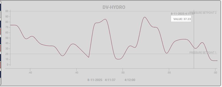
Timeseries Chart: Report

My question is: Is there a way to make the Timeseries Chart in the Reporting Module display a smooth curve, similar to the Perspective component with interpolation? Or is there a workaround to achieve a similar visual effect?
Any guidance would be greatly appreciated!
Thanks in advance,
Kemmone