I am trying to apply a SQL query onto a Easy Chart to display energy consumption. The query worked perfectly with table but failed to work in Chart, Easy Chart & Bar Chart. In Chart it shows me configuration error. In Easy Chart it shows “column ‘Name’ is absent” error. In Bar Chart it doesn’t show ant error but Bar Chart comes blank.
You can’t put your own SQL into an EasyChart. The Classic Chart (for time series) needs each dataset to have either a datetime, timestamp, or long integer (milliseconds) column as the first column, with all other columns interpreted as pen data.
Ok, so not the Easy Chart. That’s a bummer  because I am better at writing SQL query than Python script to calculate my Consumption values. I was expecting it would work effortlessly since the component has all the features in-built that I require for my data representation.
Well, how about the Bar Chart & plain Chart. Both yielded blank charts on executing the SQL query. Calculating Consumption via Tag History is something that I’m not aware of.
Any help on that front would be highly appreciated. 
Try changing the chart to a category chart and creating an x-axis that is a category. Also be sure to change the renderer to category line/shape renderer. These are properties in the chart customiizer.
Please show the dataset that results from your query. Or a handful of rows from it. An excerpt from “copy to clipboard” would do.
I tried applying the Category chart but the extrapolated data is not what I wanted. Its inaccurate.
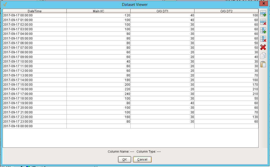
The dataset looks something like this. This contains hourly consumption of KWh values wherein 00:00:00 shows consumption for the hour from 00:00 to 01:00, in 01:00:00 for 01:00 to 02:00 and so on.
The dataset is dependent on date selection via popup calendar where binding has been created to extract 24-hour data for the selected date.
Bar Chart is unable to pick this dataset & shows blank chart.
So, I made a table with part of your data, I bound the chart data to the table data property.
Under the chart properties, be sure to change these two things.

Under the chart customizers>>X-axis tab create a new axis that is a category type

Under the chart customizer>>Dataset Properties change the X axis to your category axis and the Renderer to either “Category Line/Shape Renderer” or “Category Bar Renderer”


Hope this helps and is what you were looking to do.
Looking at your data though, you could also go with an X-axis of the date type. Just be sure to change back to XY Plot under the chart properties and change your renderer to the appropriate type. Good luck!
It did help. Thanx a lot. But then I 'll have to configure a table in every mimic in the hindsight since data is being picked from table component itself and NOT directly from mySQL?
Also how to bind x-axis to my Popup Calendar’s startDate and endDate custom properties such that on basis of date selected, the chart should automatically populate with 24-hour data of hourly interval. Also I only want to show recorded time in hours i.e. 01:00, 02:00… till 23:00 because entire datetime label eats up a lot of space and is of no use as such.