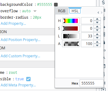
The colour picker in Perspective that shows when you click on a props colour is very small and useability is rather low. HSL and the colour palette which are my main go to’s are at either end of the tab strip, and the width of the popup is so narrow that the tab strip can’t fit, so there are scrollbars. Hence getting to my two main tabs always requires multiple clicks to scroll the tab strip left and right.
Also the colour gradients, as below, aren’t very “legible”