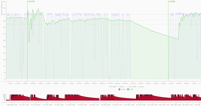
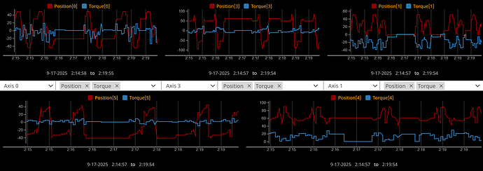
I have a chart that tracks torque and position behavior from a robot. I also track when the task program name changes, and want to reflect this on the graph so that there is a clear visual distinction between different programs being run. Ideally this would be a dynamic vertical line that is assigned the timestamp of when the new task started, and consequently moves with the x axis, until it leaves the view. There are no annotations or markers I can find that accomplish this for me.
This is similar to this example:
Did you ever figure out how to get the markers vertical? It seems at the bottom of your thread there still wasn’t a clear answer to this. I could also accept any workarounds. I’ve been trying to think of a way to do this by just making another series on the chart, but haven’t figured it out yet
I ended up using ApexChart via the free 3rd-party EmbrCharts module. This is really a great module.
I have done that by placing the chart inside of a Coordinate Container, and calculating the X position of a label/container based on its pixel width and the span within that represents a particular time:
That is exactly the look I am going for.
My chart is in a coordinate container, but I am embedding that view in a flex repeater to accomplish a variable amount of shown charts. You can see a mockup UI below where there are 5 charts (it varies 1-6 usually).
Would this calculation idea blow up once the charts start changing sizes?
Yes, if you set the container to percent mode. Then you just calculate the time between the start time and the marker time, and divide that by the time between the start and end times to get the marker X position.
I think I understand what you are saying. Do you mind sharing an example of this of yours? I assume you can have the vertical bar line up with the correct time no matter the flex/percent size if you script it this way? I am struggling to pull the first and last time displayed on the timeserieschart and using those effectively.
The red chart at the bottom of my screenshot is a ChartRangeSelector that is used to select a time span that is then passed in as parameters to the TimeSeriesChart series (a Tag History binding).
I have a list of marker times kept as a custom view property, and the X position of a marker is a binding with a script transform:
	value = value[self.custom.markersIndex]['time']
	if value is None:
		return 0
	timeSpan1 = system.date.secondsBetween(self.view.custom.selectedRangeStart, value)
	fullSpan = system.date.secondsBetween(self.view.custom.selectedRangeStart, self.view.custom.selectedRangeEnd)
	ratio = float(timeSpan1) / float(fullSpan) * 0.97
	return 0.025 + ratio
The two hardwired float values account for the width of the Y axis labels and component padding (I think, it's been a while since I did this). The markers adjust accordingly with a change in either browser window size, or selected time range.
@Ryan_Deardorff @Tim Thank you for the help!
I am exploring Ryan’s option. However the timeserieschart zoom/pan feature seems to mess with this setup. I also am not planning on fitting a range selector in my project, but it is good to know this is a viable option.
It seems until perspective comes out with some better marker features, Apex charts module might be the way to go. Just skimmed it and it looks pretty powerful.
Ah, right, I forgot, I do have those markers disappearing whenever zoom kicks in. Would be nice if the chart properties gave you access to the actual time span being displayed.
Note, though, that if you use a ChartRangeSelector as I'm doing, you can still "zoom" by narrowing the range being selected, and the markers will adjust accordingly.


