Hello! Is it possible to vertically center an axis label on a powerchart? Attached is an image for reference.

I don't think it's possible with CSS, but you can definitely accomplish it with jsInjection (If your willing to go that far).
You need to add an x attribute to the text element.
@victordcq will probably be better help with that than I am.
It just takes someone who knows what they're doing.

can be done in the designer
translate: 0px 45%
text-anchor: middle
(percentage might differ to be 50% depending on other enabled features i guess)
I suppose you would want to add a property change event to add these styles to any axes that are added by the user if it needs to be dynamic.
ahh hmm if you dont want to botehr with that its targetable with the css selector .yaxislabel too i guess
.psc-yourClass .yaxislabel {translate: 0px 45%; text-anchor: middle;}


Your translate is set to 95%, it should be 45%.
The text-anchor changes where labels anchor point is. Moving it to middle without changing it's position will move it up.
it made no difference
Did you test it in the browser? In my testing, when I put in the values exactly as @victordcq stated it did not work in the designer but when I ran a client in a browser it worked as expected.
thanks for sharing. Is it possible these arragement via runtime also?
i dont understand what you are asking
I mean that can we add these two styles in browser as in designer?
The styles applied and saved in the designer should work on all clients. Though not every browser supports every style, these should not be a problem
Thanks. I'm going to try it
Awesome! Tank you!
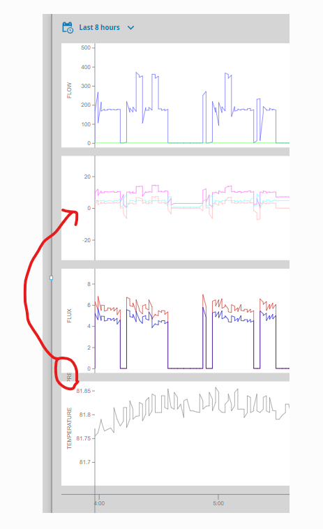
Anyone happen to have a tweak to make this work on charts with multiple plots? The 45% appears to be using the size of the overall chart..
could you show me what it looks like now?
The 3 that are in the proper position I set to 10%. The one that’s circled is set to 45%. I’m thinking I need to come up with a way to know how many plots are visible, how much area each plot is taking up (using it’s weight?) and then come up with some math that figures the correct % for each. Won’t be able to do it via stylesheet, but should be able to do it via style props..