Hi all,
I want to visualise a theoretical temperature over time (in order to let people create some recipes like heating to that point, cooling again, …). I’d also like if people could click on the graph and see what step in the recipe it is.
This seems possible to achieve through nabling the x-trace mode, and getting the crosshair position (print event.source.getChart().getXYPlot().getDomainCrosshairValue()).
Though the visualisation of the crosshairs is quite annoying for me.
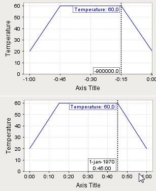
When I set the axis to be a time axis, I always see the clicked time in milliseconds (even when the axis is in a different format). Another annoyance is that the time axis displays the time in UTC, while the time comes in TZ-agnostic from the database, but automatically gets interpreted as CET in the dataset.
And when I set the axis to be a date axis, it always shows a date (like 1970 for when the time is unix based). Thoug at least the time visualisation is fine here.
I also tried with a number axis (then I could only show the integer hours), but with I couldn’t control the ticks with a number axis, so always got ticks in-between the integer hours.
Can someone give advice on what path to follow?
The X-Trace mode of Ignition’s charts are very difficult to use in any scripted or bidirectional way. I re-implemented it when I wrote the NoteChart Module. You might find it more useful, especially the traceTS and samples properties of its charts. You can use the improved X-Trace functionality whether you wish to use the annotation capabilities or not. For your application, I would encourage you to use the annotations to show the points where the process moves from one step to another in the recipe.
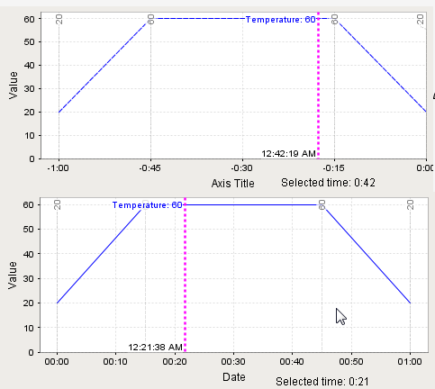
That noteChart is indeed easier to extract the selected time. And I can add notes for specific points (which is very handy, and probably what the chart was meant for in the first place). Notes are also selectable, so the user can choose between pointing at discrete nodes, or selecting over the full range, which is quite nice IMO.
However, I still can’t alter the text on the trace line. And now it shows strings like “12:45:00 AM”, instead of just the elapsed time “0:45” on both. (and the time axis still has an issue with time zones, where the time info on the axis is in UTC, but the info on the trace line and the binding are in local time).
Hmmm. Just looked at my source code – the time format isn’t adjustable. I’ll add a property for that.
As for UTC vs local time, there’s no fix for that short of changing your client to use UTC everywhere.
OK. Updated module for you to try here. The docs aren’t updated, but this should get you going. Look at the xTraceLargeTSFormat, xTraceSmallTSFormat, and xTraceTSFormatThreshold properties.
Thanks a lot, it’s looking better now.

Thanks for testing. I’ll update the docs and publish this to the showcase.
Tip: put a larger margin on the top of your Y-range so the annotations don’t overlap your high values as much.