XY Chart Data Bounds

I am using an XY chart component to produce something similar to the Gantt Chart example in the manual here. However, it seems the data I am using is being displayed incorrectly, it seems to be bound by the grid [see below image].

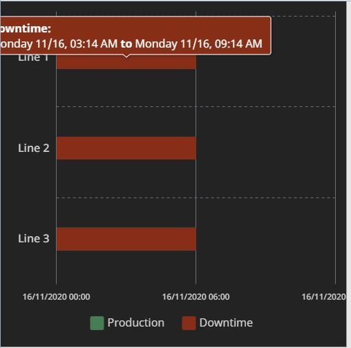
As far as I can tell the data is correct, and I’ve tried various datetime formats for both the source data and the range min/max, but nothing seems to change the display. Is there a property I am missing?

Feedback from support:

I looked into the method of increasing the granularity of the Gantt chart. I agree that the place to change that would be "xAxes[0].date.baseInterval", but I was unable to get this to work as well. I spoke with the development team regarding this, and we discovered a bug with the xAxes[0].date.baseInterval properties that is preventing the interval from going down to the minute. The development team is now aware of the issue, and they will be working on a fix for a future update.

There currently isn't a workaround for the baseInterval. Perhaps you could change the "series.column.appearance.fill" color of the columns and the "series.column.appearance.stroke" color to display a gap between the times This would not have the level of granularity to the minute, but it will show a distinction in the times.

p.s. support did not take this long to reply, I just forgot to update the post :slight_smile:

1 Like

Hi Matthew,

Thank you for sharing the information from support.

Since the intervals seem to be bound by the grids, I tried varying the grid distance instead of using the 'baseInterval' property. And it worked for me.

Hopefully this workaround will work for you also.

1 Like