Help Needed: Dynamic Bullet Color in XY Chart Based on SQL Data (Perspective)
Hi everyone,
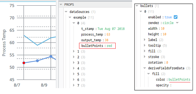
I’m currently working on a Perspective XY Chart, and I need help applying dynamic bullet colors in series[0] based on a threshold value.
![]() Objective:
Objective:
Color the bullet (marker) of each point in the chart:
Red if the Y-axis value exceeds a threshold (e.g., > 1)
Blue otherwise
![]() Setup:
Setup:
Chart Type: XY Chart in Perspective
Series: series[0]
Data Source: Named Query (querying SQL data)
Dataset contains:
Timestamp (x-axis)
NumericValue (y-axis)
Source (label/tooltip)
![]() What I Tried:
What I Tried:
I bound series[0].data to the Named Query and applied a Script Transform to add a "bulletColor" key per row, like so:
newData =
for row in range(value.getRowCount()):
xVal = value.getValueAt(row, "Timestamp")
yVal = value.getValueAt(row, "NumericValue")
sourceVal = value.getValueAt(row, "Source")
newData.append({
    "x": xVal,
    "y": yVal,
    "source": sourceVal,
    "bulletColor": "red" if yVal > 1 else "blue"
})
return newData
In the chart configuration, I set:
series[0].x → "x"
series[0].y → "y"
series[0].source → "source"
series[0].bullet.fill → "bulletColor"
![]() Issue:
Issue:
Despite trying this approach and variations of it:
The bullet color is not changing dynamically
Or the chart throws an error like "array found, string expected"
Or the chart shows no data
![]() Questions:
Questions:
-
Is this approach officially supported in Perspective for per-point bullet colors?
-
Does bullet.fill accept dynamic values from series[0].data rows?
-
Is there an alternative method (e.g., using scripting or styling per series) that works reliably?
Any guidance, working example, or reference is truly appreciated — I’ve been exploring this for a few days and would love to know if others have solved this cleanly.
Thanks in advance! ![]()
