Ran a quick test on my 8.1.28 gateway and seemed to work fine. Might be conflicting with some other property you have set on the charts that isn't visible in your clip? I just took the built in line chart example and only modified them enough to have two synchronized charts and the yaxis settings to match what you're showing:

Interesting, I use 1.0.14 with 8.1.29, could you test it in your end.
Apex.zip (26.0 KB)
Pretty sure the root of your issue is that you are naming your xy value keys in an unsupported way with the t_stamp / realistic key names. See here for supported formats and key names for the series data array.
This will also prevent unexpected behavior because when the key name is not recognized, the charts will default to interpreting which value is the x and which value is the y based on the order of the values. Since objects don't hold order on export/import, you can get the order to flip which is what happened with your export when I imported into my own gateway (t_stamp was shown on the y-axis and realistic was shown on the x-axis).
Last note, decimalsInFloat is not a boolean property. Should be an integer.
I follow this as you told me but it is not working with Timeline Series:
series: [{
data: [[1324508400000, 34], [1324594800000, 54] , ... , [1326236400000, 43]]
}]

This problem is related to only data with Timeline Series. Also, Travis adds support directly to use history binding which is why I use it in the first place.

Good workaround but it is definitely is a bug for t_stamp.
What version do you use?
What's the t_stamp bug? That you can't use it as a key name?
Same as you for the ApexCharts module: 1.0.14
Still on 8.1.28 for Ignition though since 8.1.29 was pulled due to a regression and 8.1.30 is still too new for me to bother with yet.
I mean that when you need to round up value when using time series data that come from history binding.
Check out this:
Refactored to adjust series data automatically if not in the correct format, especially from Ignition's tag historian queries.
It should be work but it doesn't
I would think that there is a good chance that the bug with tickAmount not working as expected when there are too many decimal places is a bug within the Apex Charts library, not the Ignition module. But maybe not, just guessing.
Luckily, we have Travis Cox and he supporting and updating the module.
Hi folks I have a little problem with displaying real-time data
@pturmel @nader.chinichian @bmusson helped me a lot to reach that result but I can't overcome the snap-shot style displaying graph
{
  "chart": {
    "animations": {
      "dynamicAnimation": {
        "speed": 1000
      },
      "easing": "linear",
      "enabled": true
    },
    "dropShadow": {
      "blur": 5,
      "color": "#52AFDE",
      "enabled": true,
      "opacity": 0.7
    },
    "toolbar": {
      "show": false
    },
    "zoom": {
      "enabled": false
    }
  },
  "colors": [
    "#77B6EA",
    "#545454"
  ],
  "dataLabels": {
    "enabled": true
  },
  "grid": {
    "borderColor": "#e7e7e7",
    "row": {
      "colors": [
        "#f3f3f3",
        "transparent"
      ],
      "opacity": 0.5
    }
  },
  "legend": {
    "floating": true,
    "horizontalAlign": "right",
    "offsetX": -5,
    "offsetY": -25,
    "position": "top"
  },
  "markers": {
    "size": 1
  },
  "stroke": {
    "curve": "smooth"
  },
  "title": {
    "align": "center",
    "text": "Tank Level"
  },
  "xaxis": {
    "title": {
      "text": ""
    },
    "categories": [
      "46:49",
      "46:50",
      "46:51",
      "46:52",
      "46:53",
      "46:54",
      "46:55",
      "46:56"
    ]
  },
  "yaxis": {
    "max": 100,
    "min": 70,
    "title": {
      "text": "Filling %"
    }
  }
}
The X-Axis has a query binding that gets time with a script transform that changes format
If anyone can help I would appreciate it a lot
@thewebpleb @kyvislabs
-
What exactly are you binding to your series data?
-
What is going on with your X-axis categories? Where are those values coming from and what are you trying to do?
Hi @kyvislabs and @Travis.Cox,
Is it possible for you guys to kindly add the supporting "module" arg to the chart "props"?
Like the Following code. Here I use the "Selection" module and pass it to the modules arg to support the multi-selection option to the Apexchart.
// Import ApexCharts and the selection module if you are using ES6 modules
import ApexCharts from 'apexcharts';
import { Selection } from 'apexcharts';

const chartData = {
  // This come from Perspective with "series" Property
};

const chartOptions = {
// This come from Perspective with "options" Property
};

// Create the chart instance
const chart = new ApexCharts(document.querySelector('#chart'), {
  series: chartData,
  options: chartOptions,
  modules: [Selection],
});

// Render the chart
chart.render();
For those who are interested in multi-select date items use the following object in the options:
I find the solution for this by using the state object in options:
{
"active": {
"allowMultipleDataPointsSelection": true,
"filter": {
"type": "darken",
"value": 0.2
}
}
}
Hi
Does anyone see this strange behavior for mobile mode in the browser:
When opening the web browser and going to mobile mode the Bar chart and Pie chart scale incorrectly, but in designer with the same width they render correctly.
Also in normal sizes in the Browser, these two charts are OK.
Other charts are totally fine in any mode.
I test in v1.0.14, 1.0.15 and 1.0.16.
Here are some screenshots to explain this problem:
Mobile:

Designer:
Desktop in Web:

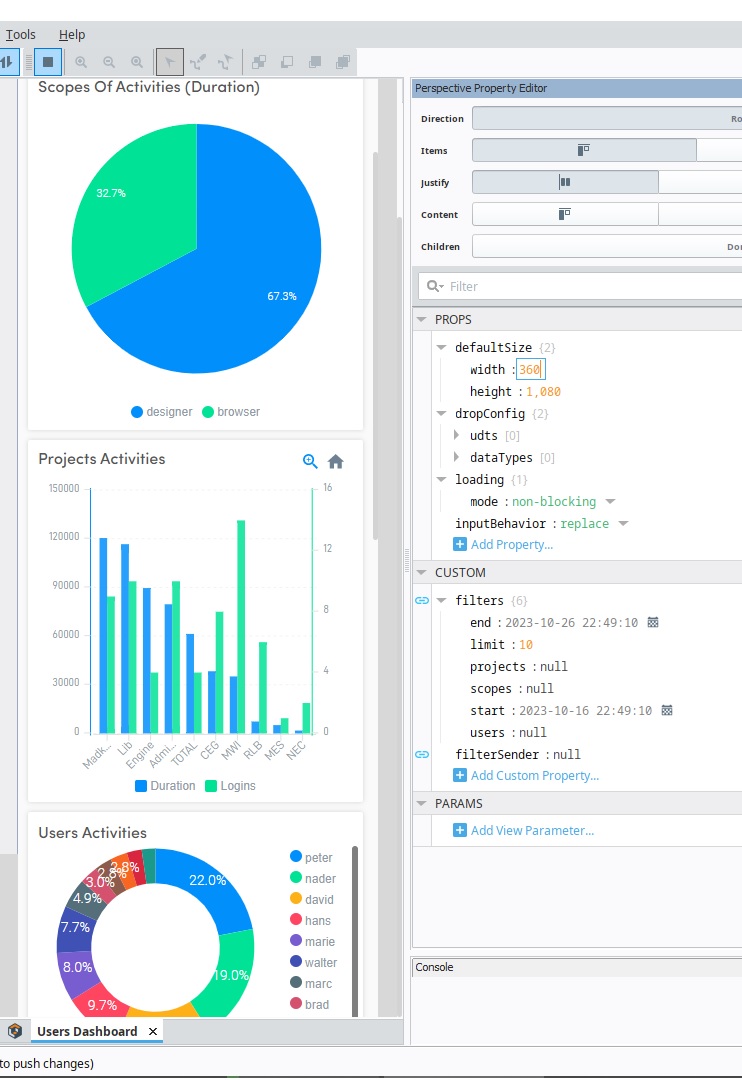
Your issues aside, that's an amazing dashboard (UI design) and a cool project idea!
The enableOnSeries property of dataLabels doesn't work in our project. Whether I use it or not, the values for all series are displayed on the chart. How can I get the chart to only display the values for one series? Thanks
It should be enabledOnSeries

Ah! I was entering the series index array as a 'value' (enabledOnSeries: [1]) rather than selecting 'Array' and entering the series index below. Thanks a lot!
@nader.chinichian dropped a vid with this UI earlier today: https://www.youtube.com/watch?v=mXJTkBjc-w8