I've had a new customer come to us with an issue with the Power Chart where he was confused why in the chart below, the blue line linearly interpolates from 0 to 307 between ~9:04 and ~16:07, where is should be flat at 0.
Usually I've been able to set the Interpolation mode in the chart to one of the stepped modes (e.g. CurveStepAfter) which will force the trend to be stepped instead of interpolated, but it isn't helping in this instance for some reason. For giggles, I've tried all of the Interpolation methods and they all rended the interpolated line from 0 to 307 instead of a horizontal line at 0 which then jumps up to 307.
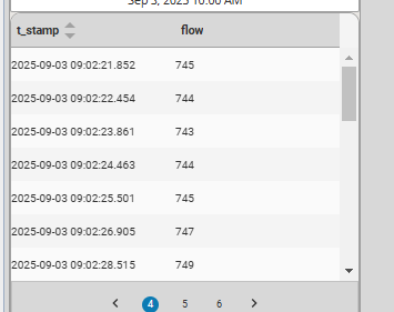
I queried the raw "as stored" history and it shows the value didn't change from 0 for the 7 hours between the dates.
I'm a bit stuck at the moment.. setting the point count to -1 to return as stored data fixes it, but is impractical due to the sheer number of values that could be attempted to be shown
Your chart and the raw values don't match, theres something different between them.
319 -> 0 -> 307 should be an almost perfect square wave, your chart doesnt match those numbers?
There are actually just a lot of value changes between 9:00 and 9:04 that so from the mid 700s down to 0, but in a very short time period which is why it looks like it just drops from mid 700s down to 0. I will need to look at the history settings on some of these fast-changing tags to reduce the capture rate. But there are 0 data points between 9:04 and 14:07, but the function that retrieves the values is still interpolating between these two distance points which results in the long straight line from 0 to 307
I am actually interested in this post, I have had a lot of issues with interpolation and bad data with the Power Chart and none of it has followed complete logic or reason.
It usually drives every customer that tries to look at power charts a bit crazy to be honest, and they always ask me what's going on and why their trend doesn't look like they should. Hoping the power chart overhaul planned will resolve this!!
This topic came up a lot during training sessions. The main reason I've found that causes this is actually in the tag historical configuration, specifically the deadband style property.
There are three options, auto (default), Analog and Discrete.
Auto will choose either Analog or Discrete based on the tag type. Basically anything with a floating point is set to analog.
An analog deadband style always assumes a linear path. Think of temperature, it's impossible to jump from one temp to another without transitioning. So if we assume linear interpolation, that helps remove historical points that fall on a linear gradient.
If a tank was heated over a day with a linear rate of change, only two points actually need to be recorded in the historian to recreate the historical trend, the start and end points. All other values between can be assumed with a linear interpolation. If there were any significant deviations in the day then the analog deadband would have triggered a point to be stored.
This is also the reason why some power charts seem to interpolate to the current value. Only when a new sample is taken will the trend update the previous sample. It actually doesn't store a point until a new point is recorded, at that time it checks to see if the new point and old point are within a linear gradient from the previously stored point. If they all line up on a linear gradient then the previous point is discarded and the new point is stored in a holding register no updates are stored in the historian. Only when a new point doesn't line up with the previous (within the deadband) then the previous point is inserted into the historian and the new point is stored in a holding register.
The best way to prevent these is to either set the maximum time between samples. Or set the Deadband style to Discrete.
This is what I have done previously, but it has the downsides of potentially significantly increasing storage space required, and reducing the ability of seeing actual discrete data points (i.e. one 0 instead of 420 0's for that 7 hour period).
I wouldn't have thought that the deadband style would have any effect on the display of the data, as I thought this was only used to determine whether or not the tag uses the analogue storage algorithm when new values come in. It would make sense if this is the case though as it would explain why the chart is misbehaving here.
For the moment I've allowed the operators to switch to showing the raw data points with the disclaimer that their client (and gateway/network) might die trying to serve up 100's of millions of records when they select 20 pens over 3 years
I'm pretty sure the display.Interpolation property is applied to the displayed trend data after the points are aggregated and interpolated from the historian raw data to match the required point count.
These trends are both incrementing second counters. The green has an analog deadband style and the orange is discrete. Other than that they are setup the same with a deadband of 5.
The display.Interpolation is set to curveStepAfter. Setting the pointCount to a high number make the charts interpolate between samples linearly on the analog but not the discrete.
Also I just ran some tests and it looks like 8.3 doesn't function exactly as 8.1 did with the power chart and interpolation. I assume you are using 8.1 for the customer still.
Hi @nminchin , we encountered the same issue in the past, and at that time, we suspected the temperature readings were drifting. We spent time in the field changing the probe and making other adjustments.
However, we eventually discovered the problem wasn't the hardware but the interpolation. We switched the Deadband Style property to Discrete for all our tags and that completely solved the issue. We haven't had any problems since.
Yeah it does seem like the default analogue mode has limited use-cases given this is the case. It's more likely to deceive operators which can cause misdiagnosis of issues, or false positive identification of phantom issues like in your example which send you down a rabbit hole
I’ve encountered this issue and have always set deadband to discrete to avoid the weird interpolations that occur. Seems counter intuitive to have an analog defined as discrete, but it works.
Just adding that I have come to the same conclusion over time. I always use discrete deadband mode because the EasyChart in Vision has the same odd behavior when using trends using analog deadband mode.