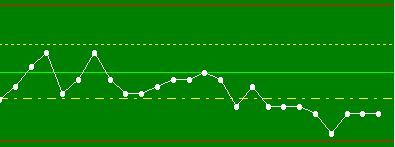
I'm looking to use a sparkline chart for some data I have, for quick visual comparison. Looking at how it works, it appears to be setup to work only with date/time and a value. Is there a way to switch this to a basic sequential ordering rather than date/time? I can use date/time, but unless I make up fake ones, there's a large gap that appears between points that are further apart than others.
Visually, the sparkline is exactly what I'm looking for (when setup with consistent interval data), but the backend seems a bit overly strict. My goal is to use it to track variations in manual user inputs with varied timing between inputs, but being this is going into a table format styled page, the regular charts are a bit too big.
Is this possible, or do I need to look at creating a custom module to achieve this? Worse comes to worse, I can always use fake date/times, but I'd prefer to avoid the possibility of someone, down the road, improperly linking the fake date/times to the data as if they were the actuals.
This is probably not what you are wanting to hear, but if you generate the time stamps starting at 0ms UTC and incrementing by one each time, then your timestamps will show as either December 1969 or January 1970. If someone in the future were to looks at these time stamps and see that they are sequential, one millisecond apart and over 54 years ago, it should be pretty obvious they aren't the real time stamps. Plus in the code where you generate the fake timestamps you could document that they aren't real, and the purpose that they serve. If you also have another centralized location of project documentation you could also add the timestamp disclaimer there.
example code converting a custom dataset property named rawData with sequential data in it to something compatible with fake timestamps:
if event.propertyName == "rawData":
	data = system.dataset.toPyDataSet(event.newValue)
	newData = []
	for i, row in enumerate(data):
		newData.append([system.date.fromMillis(i), row["value"]])

	event.source.data = system.dataset.toDataSet(["t_stamp", "value"], newData)
The generated timestamps would be pretty obviously fake in my opinion:

1 Like
Yeah, I kind of came up with a similar idea while I was typing out the question. It's too bad there's not an abstract sparkline that can just take an ordered array of numbers and display them in the order they appear in the array... would save a lot of extra overhead trying to jerry-rig it to appear to work that way.
Some day I'll start making my own custom modules, but there's still too much left to learn on this side of that fence, and this is a small feature compared to my overall project...
Thanks for the help, anyway! I'll probably do what you showed until I get time to refine it, more (and feel confident in jumping that fence  )!
)!
1 Like
Much simpler than the overhead of a custom module is the Paintable Canvas component, which gives you direct access to Java's underlying 2D graphics primitives. It would be "easy" to make your own sparkline this way, by simply reading some input dataset as x/y points to draw.
@justinedwards.jle might even do it for free, if you catch him in a good mood 
3 Likes
I will have to take a look at that. Did not know that gives you access to Graphics2D (Honestly, I never even thought to look at that component, yet!). Now that is something I'm familiar with! That said, I wouldn't turn down someone who wants to help me out, "for fun"  Thank you for that tip!
2 Likes
Check this out:
Paintable Canvas Hacks
I have a big todo list this week at home, but I'm taking a day off this Friday, so if you or somebody else hasn't figured it out by then, I'll take a look at it.
To help is out, can you provide some sample data, and a mock image of what you expect it to look like?
2 Likes
My mind went a little wild with the possibilities once I realized I could use more of my Java knowledge on this one... Here's an example of what I'm trying to accomplish, though this one's a little more complex than it would need to get:

Once I get the graph working (insert case of "mind went wild", here), I'll be looking at making a mouse-over affect so I can see the exact values of each input point when I get near them. I plan to limit how many historical points display at one time. I shouldn't need more than 20-30 points in order to see a developing trend.
I do want to tackle this one myself, some, but my primary responsibilities at work reset at the start of the month, and this is a "when time is available" project... for now  . -sigh- Why do I always have to be so proactive?
Edit:
Here's an example of some output:
| dateTime |
rid-0 |
| 2024-06-24_08-06_13PM |
10.658 |
| 2024-06-24_08-06_51PM |
10.7 |
| 2024-06-24_08-16_00PM |
10.589 |
| 2024-06-24_08-17_20PM |
10.765 |
| 2024-06-24_08-19_42PM |
10.82 |
| 2024-06-24_08-40_36PM |
10.746 |
| 2024-06-24_08-44_02PM |
10.854 |
| 2024-07-25_04-28_24PM |
10.75 |
This is some test data of values I recorded using the functioning part of the program I've been writing. As you can see, the date/time values are pretty varied, which results in a weird, non-uniform sparkline chart (all the earlier points are bunched up on the left with a long line to the last one on the right). The data is just saved to a CSV, for the time being, so it can be read back in, later.
2 Likes
That looks simple since it doesn't implement arcs. Almost the whole thing could be done with graphics.drawline.
The toolTipText property of the paintable canvas could be set to the value of a dot during the mouseMoved event to create the value popups. Simply create a bounds around each data point using something like:
def getCanvasToolTipText(paintableCanvas):
	from java.awt import Point, Rectangle:
	data = paintableCanvas.data # This would be a custom property
	pointTolerance = 5 # pixels

	# This will need to be the same as the canvas
	# ...and probably scaled using initial canvas dimensions in case somebody resizes the chart
	pointSpacing = 20 # pixels
	for row in xrange(data.rowCount):
		value = data.getValueAt(row, 'value')
		# Create a rectangle with a radius of 5 pixels around each point
		x = value - pointTolerance
		y = pointSpacing + (row * pointSpacing)
		width = 2 * pointTolerance
		height = 2 * pointTolerance

		# If a rectangle contains the current event coordinates, change the tool tip text
		if Rectangle(x, y, width, height).contains(Point(event.x, event.y):
			return value
	# If nothing is found, return a blank string
	return ''

paintableCanvas = # path to canvas

# set the tooltip text no matter what, so if nothing is found, the current text is cleared
paintableCanvas.toolTipText = getCanvasToolTipText(paintableCanvas)
2 Likes
Exactly what I was thinking! I'm figuring it will take longer to setup the data interpretation than to actually draw it out. And it will probably take longer to organize the data from the CSV (since it's a dynamic list) than to setup the interpretations. Overall, it shouldn't take more than a couple hours, once I start. It's one of those things that looks more difficult [to a non-programmer] than it actually is. Will be a breath of fresh air compared to all the stuff I've been doing that looks simple [to a non-programmer] that's actually quite difficult... then when I go to show it, they're like "that's all?". Ahh the life of software development...  and I'm still just a noob, lol.

